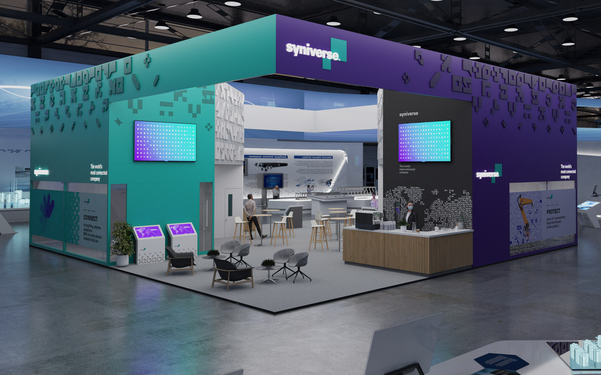
Revenue by Design: From an Abstract Brand to a Lead-Gen Engine
Specifications
- Design direction
- Strategy
- Customer experience
- UX design
- UI design
- Immersive experience
Revenue by Design: From an Abstract Brand to a Lead-Gen Engine
Specifications
- Design direction
- Strategy
- Customer experience
- UX design
- UI design
- Immersive experience