Santander bank
Specifications
- Strategy
- Creative direction
- UX/UI
- Visual design
- Illustration
- Motion direction
Santander bank
Specifications
- Strategy
- Creative direction
- UX/UI
- Visual design
- Illustration
- Motion direction
Specifications
Specifications
the context


The key concept and visual identity were defined and executed in a five-day sprint. Through rapid briefing and alignment sessions, we set the concept, style, and tone, then moved quickly into execution with character design, color exploration, and development of the key visual, refining it through several iterations.
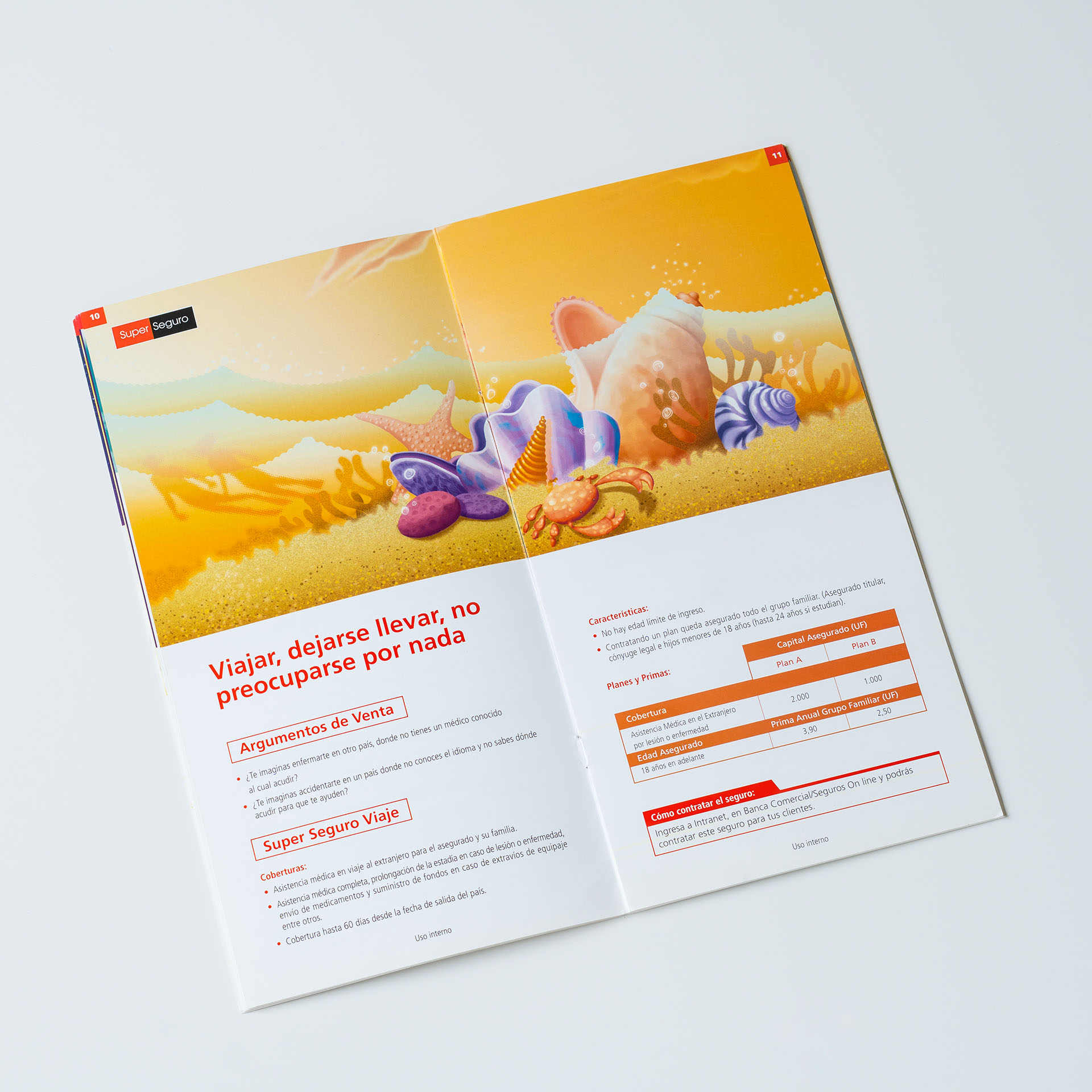
Working closely with a team of designers and animators, we produced adaptations across multiple media and formats. These included online banners, digital displays, and print applications, spanning press materials, environmental graphics, and large-scale placements across the city and bank branches.
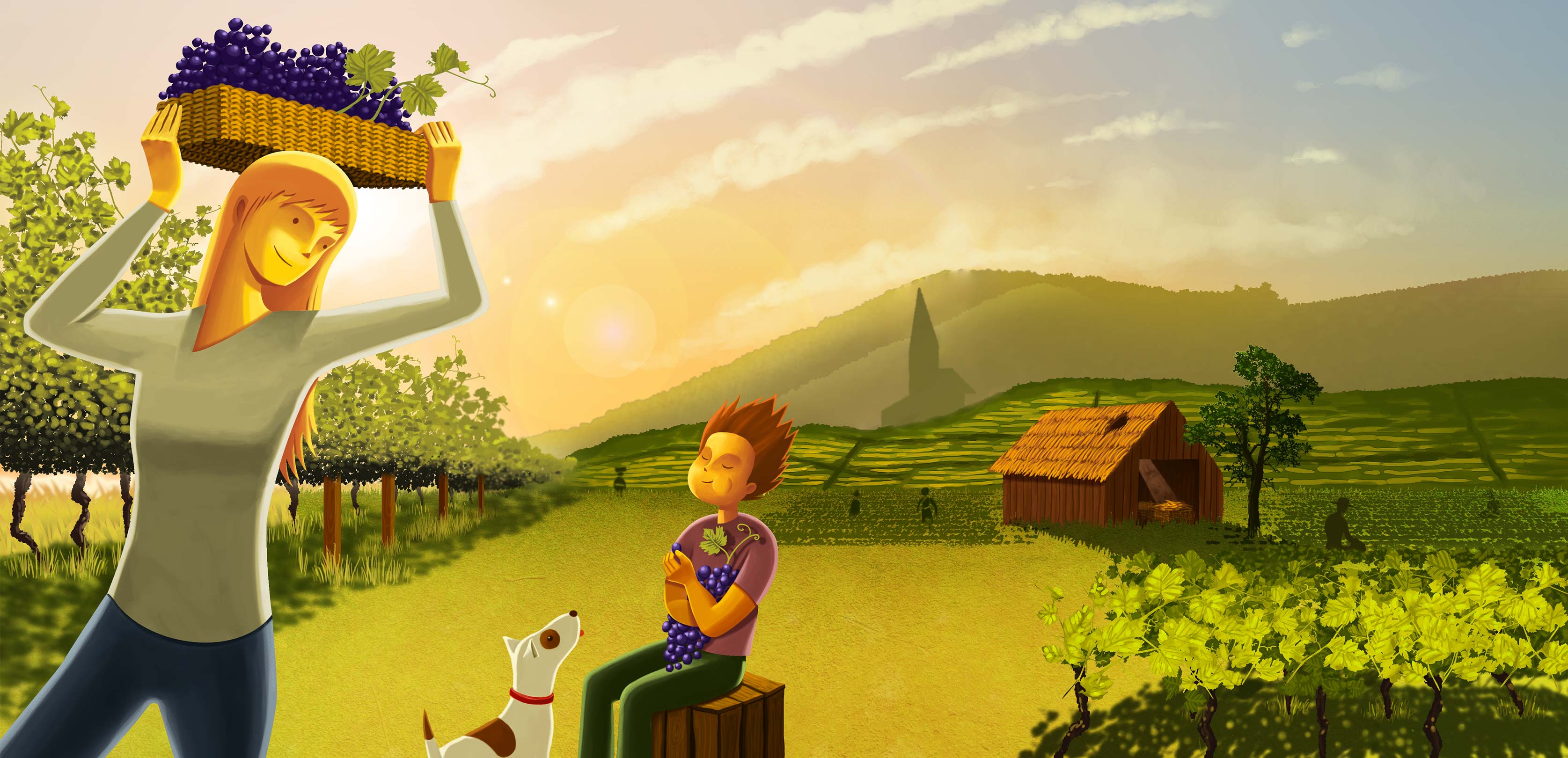
A visual language defined by bright colors and a playful sense of whimsy, brought to life through humorous, character-driven illustrations.
Animations were developed for deployment across many channels, spanning offline and online contexts, and scaled to fit formats nationwide.
Large displays like city bus stops featured the key animation, accompanied by simple, bold celebratory statements.

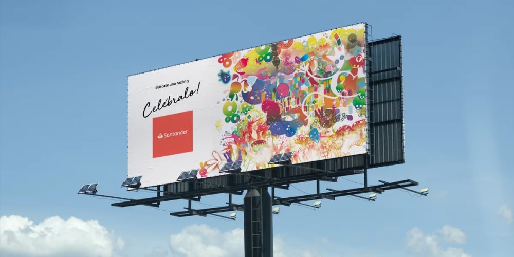


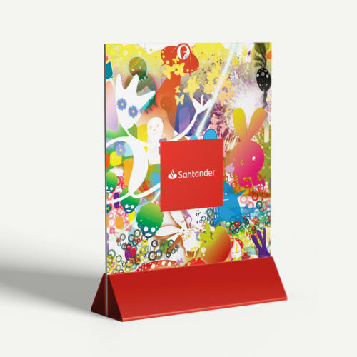
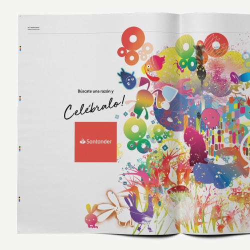

The palette is explosive and saturated, mixing warm gradients with electric brights. Colors overlap and blend freely, creating a festive, high-energy atmosphere that feels playful, optimistic, and deliberately maximalist in its visual impact.

The composition is dense and layered, with no single focal point. Elements float, collide, and interweave across the canvas, creating movement and rhythm. The lack of rigid hierarchy reinforces a sense of celebration, chaos, and joyful abundance.

Whimsical, cartoon-like characters blend human, animal, and imaginary forms. Expressive eyes and playful proportions recall Takashi Murakami’s pop exuberance and Gary Taxali’s quirky, nostalgic illustration style, creating a joyful, surreal cast.
identity
Through in-depth stakeholder interviews and discovery, I translated business goals into a clear, validated identity system, designed and executed end-to-end, from logo to digital and physical applications.
The insights

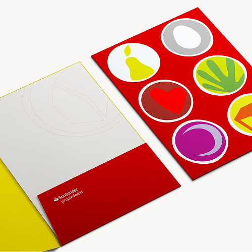
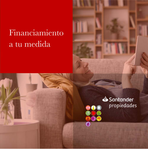
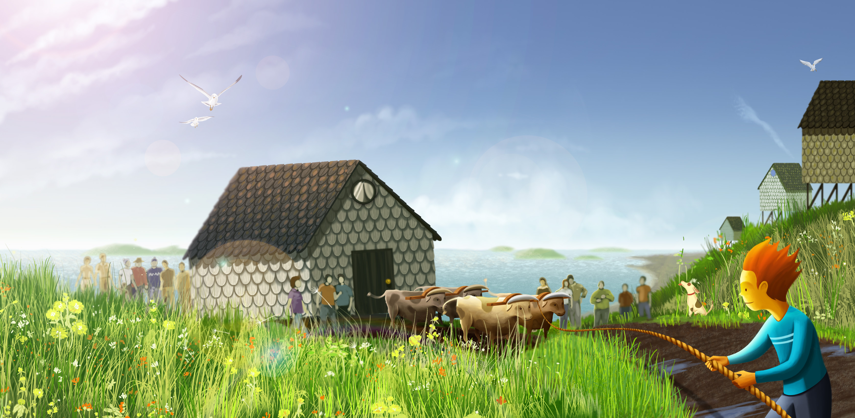
The project explored what home and property mean emotionally and rationally. From dreams to investment, this led to Mundo Propio / Your own private world, positioning Santander Propiedades as a trusted guide that simplifies a meaningful life decision.

The identity is built on trust, simplicity, and companionship. Backed by Santander’s credibility, the brand balances professionalism with warmth, making complex processes feel clear, human, and approachable.

A warm, cinematic visual language expresses personal worlds and lived-in spaces. From logo to imagery and environments, the system blends function and personality across digital, print, and physical touchpoints.
Applications


Immersive social