ux | ui
With 47K+ social media followers and a book published in 4 languages, Karen Barbé needed a brand and website that captures her unique essence. Which is exactly what I designed the website with a mobile first approach.
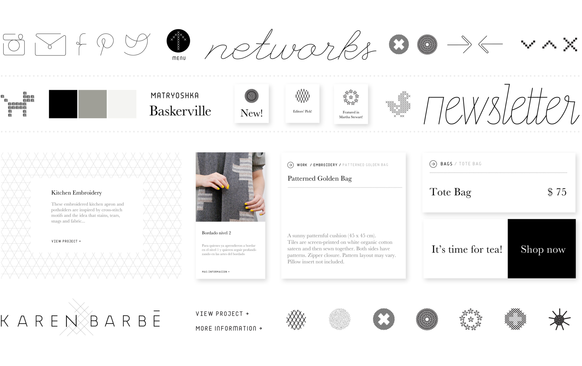
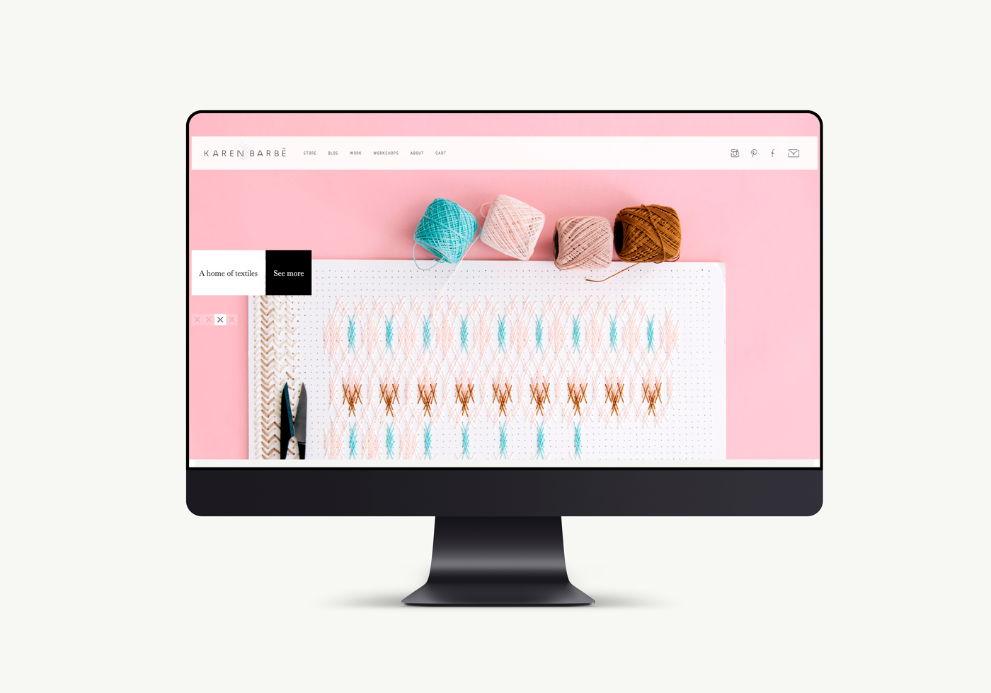
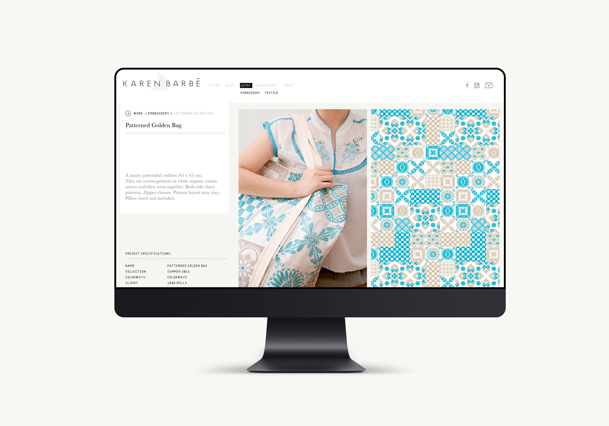
I designed and produced a fully responsive website and branding elements for textile designer Karen Barbe. The approach consisted in adopting a muted color palette and subtle typography and layout in order to highlight photography. The website was designed to pair with a renewed branding, keeping visual consistency across every touchpoint of engagement with the brand.
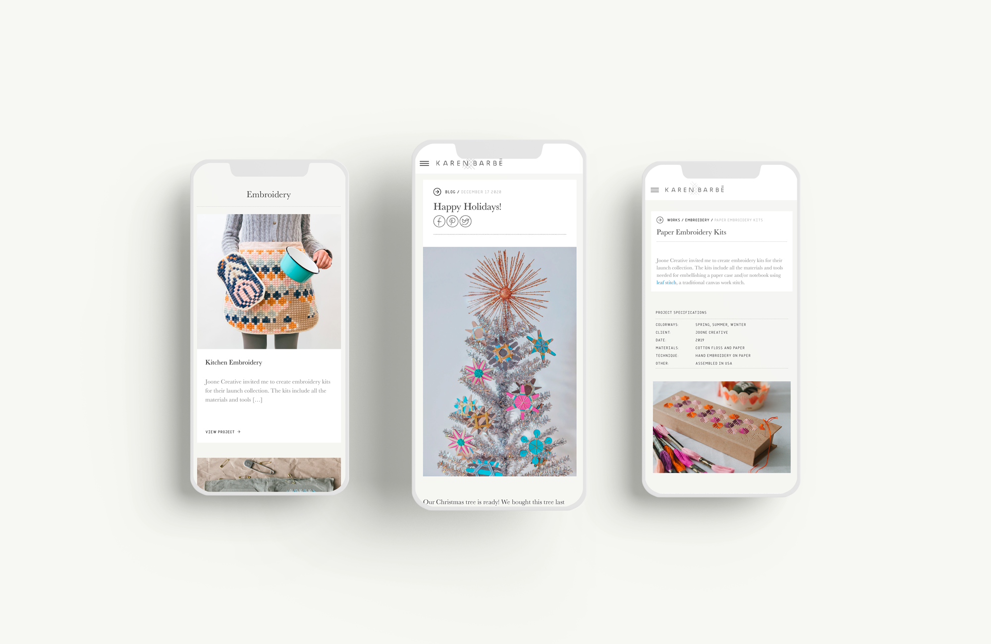
The entire visual language is an interpretation of the needlework that sits at the core of Karen Barbe’s work. This is graphically manifested by the use of crisp surfaces and line work for icons, interface elements and backgrounds. A monospaced typographic family also evokes the underlying grid of needlework while at the same time, aligning with the modern look and feel of Karen’s work. At the same time, the entire UI is at the service of accentuating the brilliant photography executed by Karen.
Visit karenbarbe.com