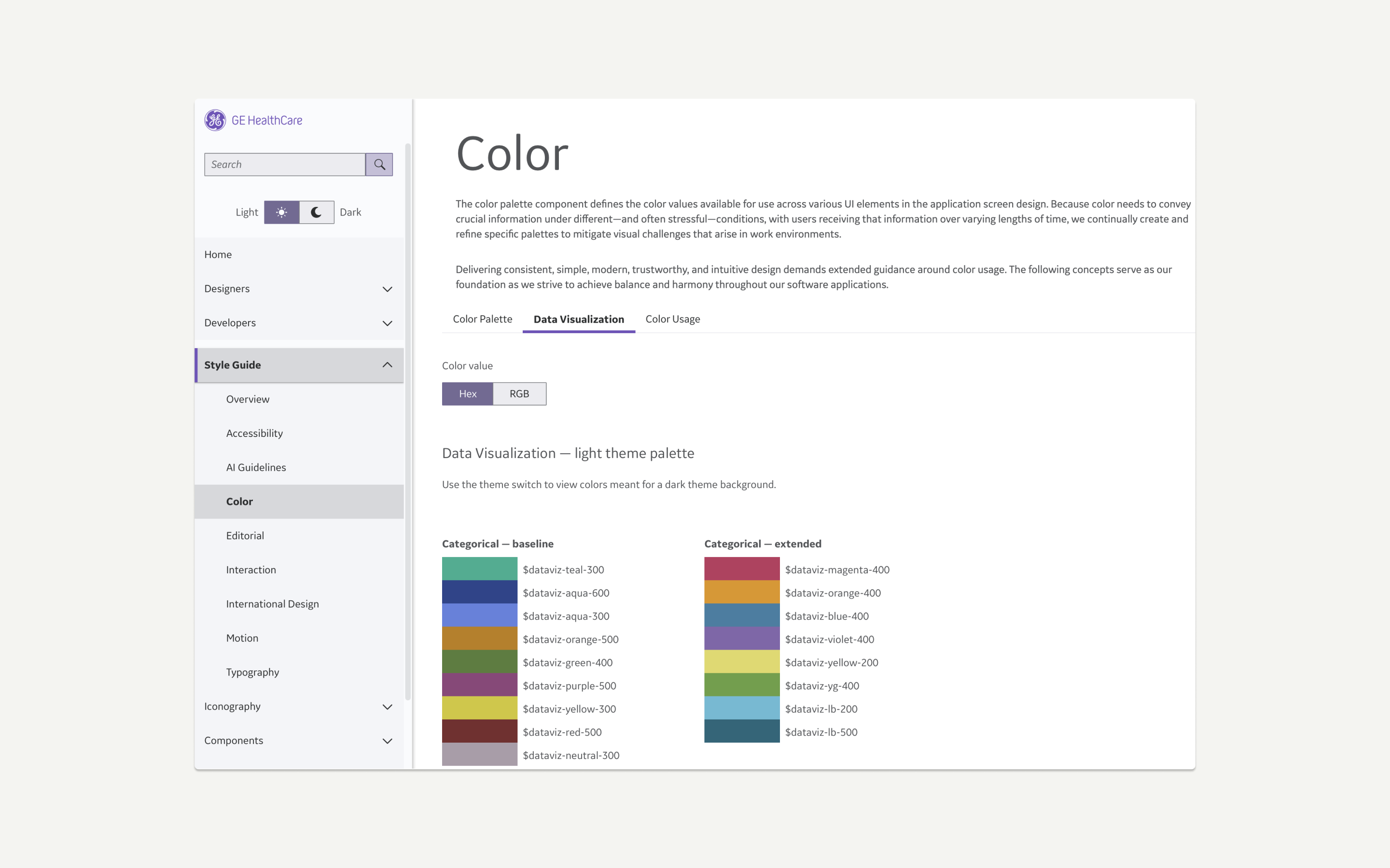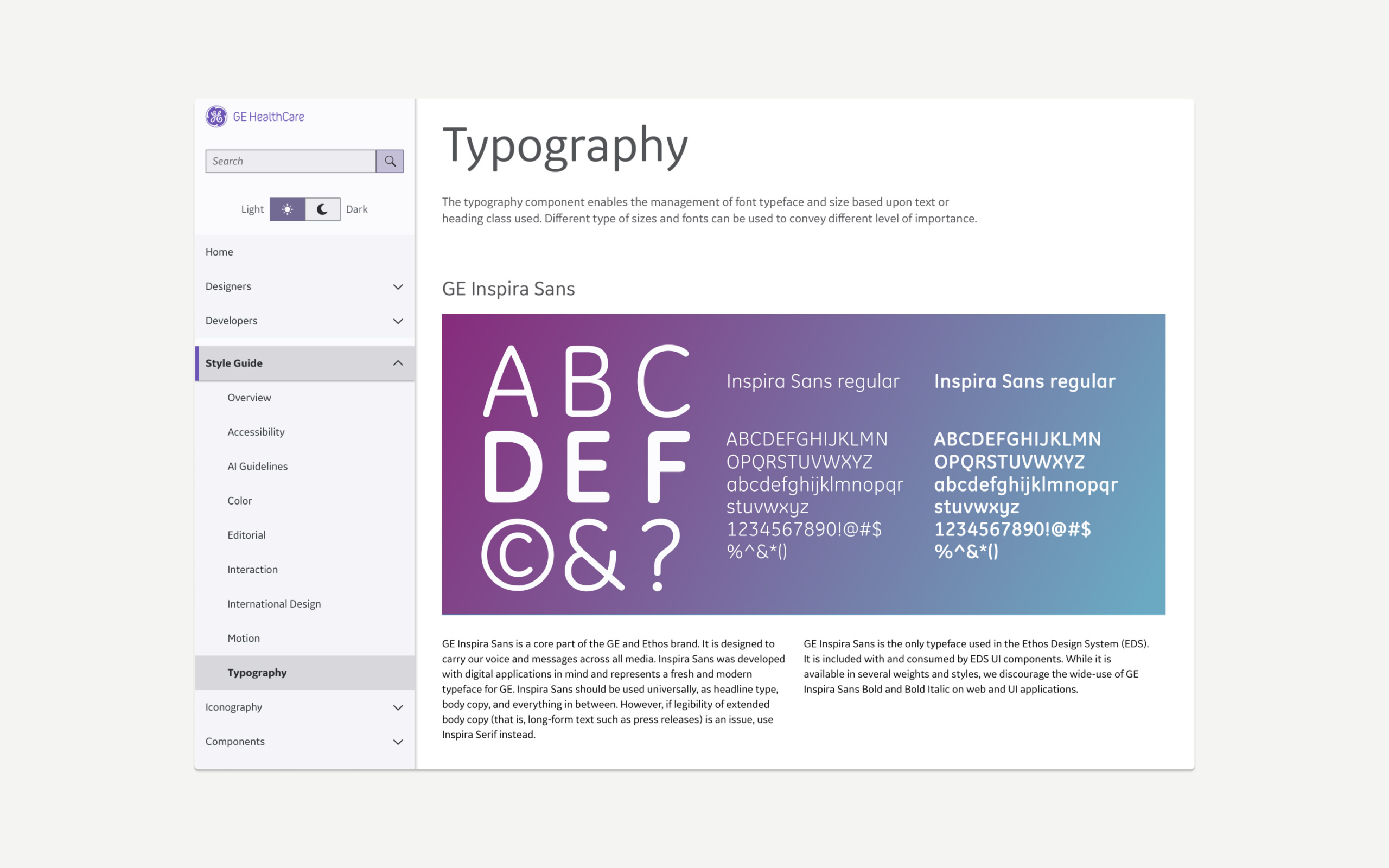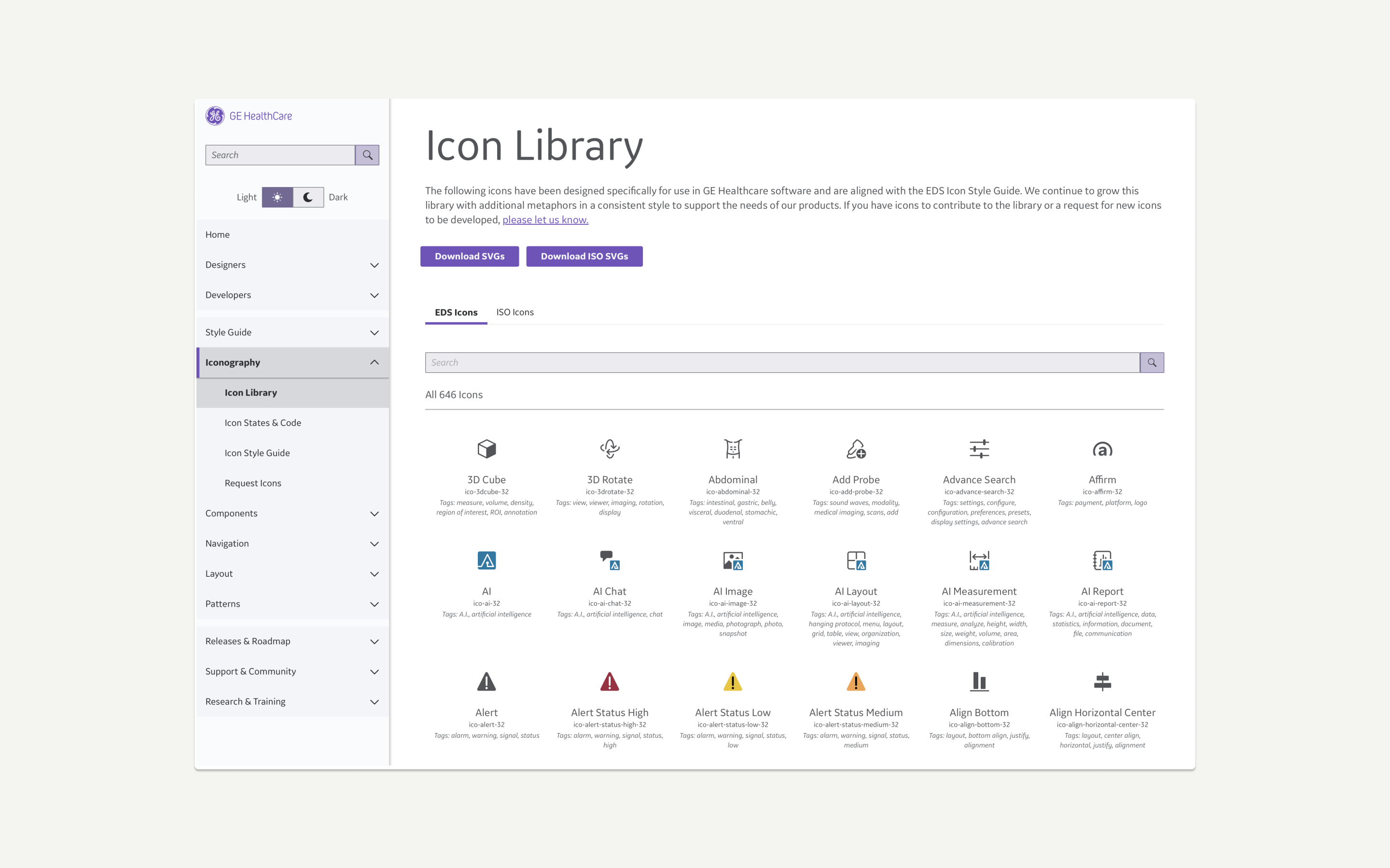
Edison Design System
I provided new direction of core visual guidelines for the Edison Design System and expanded a multiplicity of components with use cases, guidelines and overall documentation. Role: Staff Senior UX Designer. Discipline: UX | UI
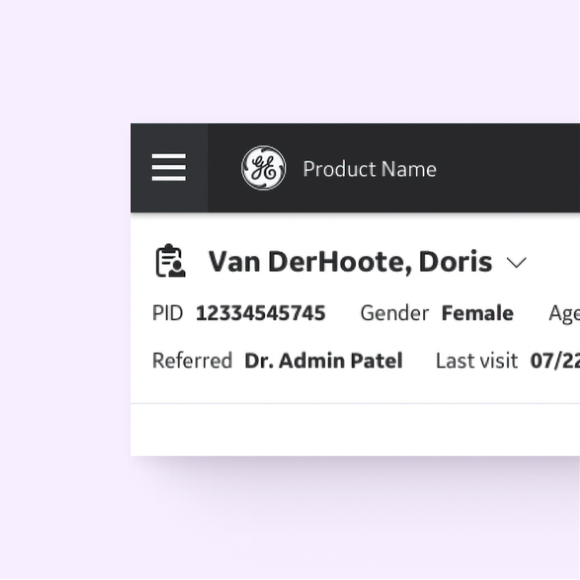
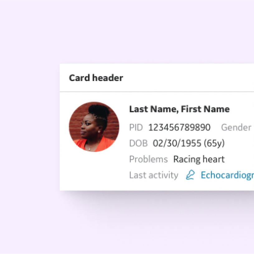
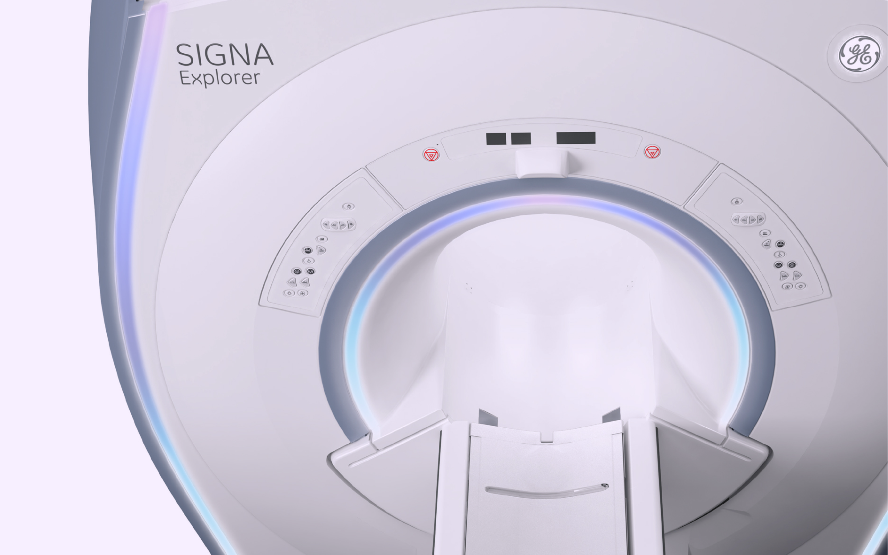
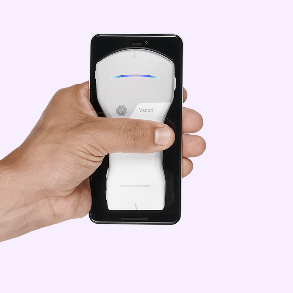
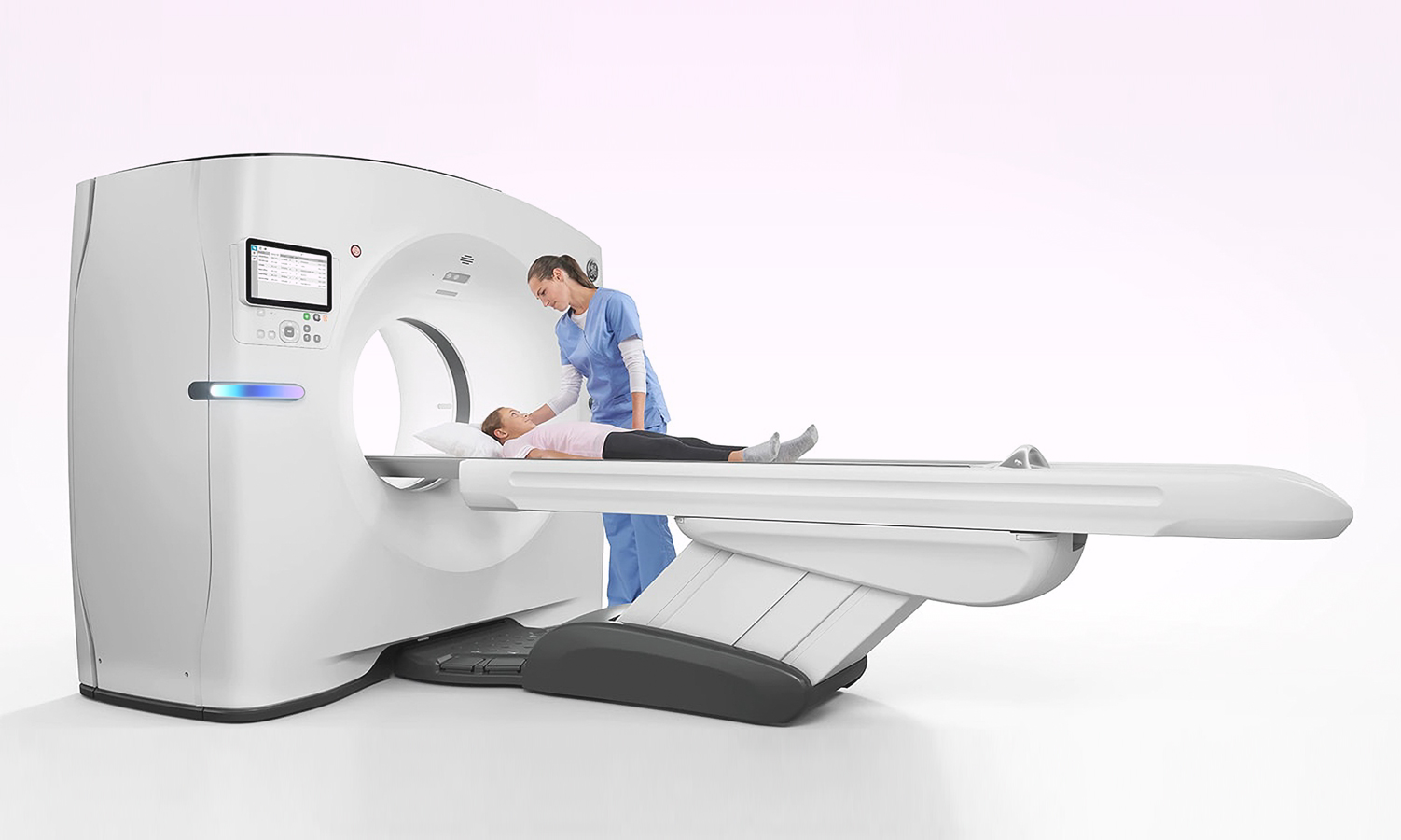
Edison Design System
I provided new direction of core visual guidelines for the Edison Design System and expanded a multiplicity of components with use cases, guidelines and overall documentation. Role: Staff Senior UX Designer. Discipline: UX | UI