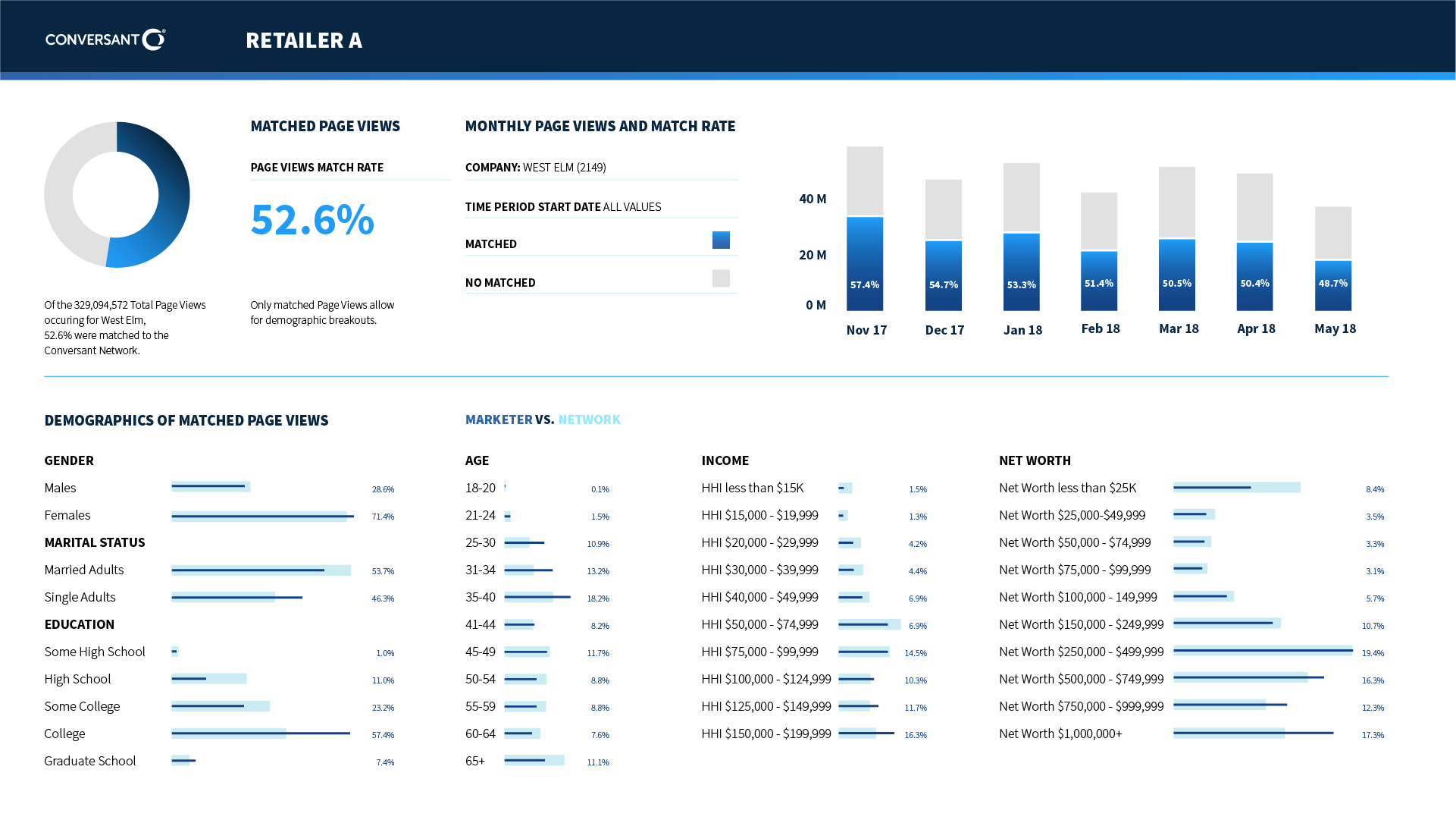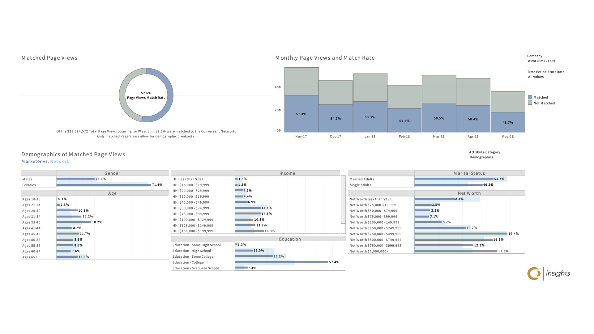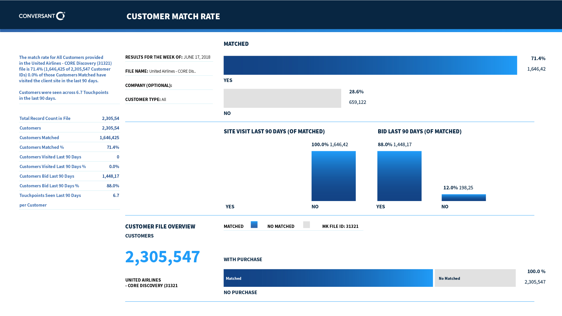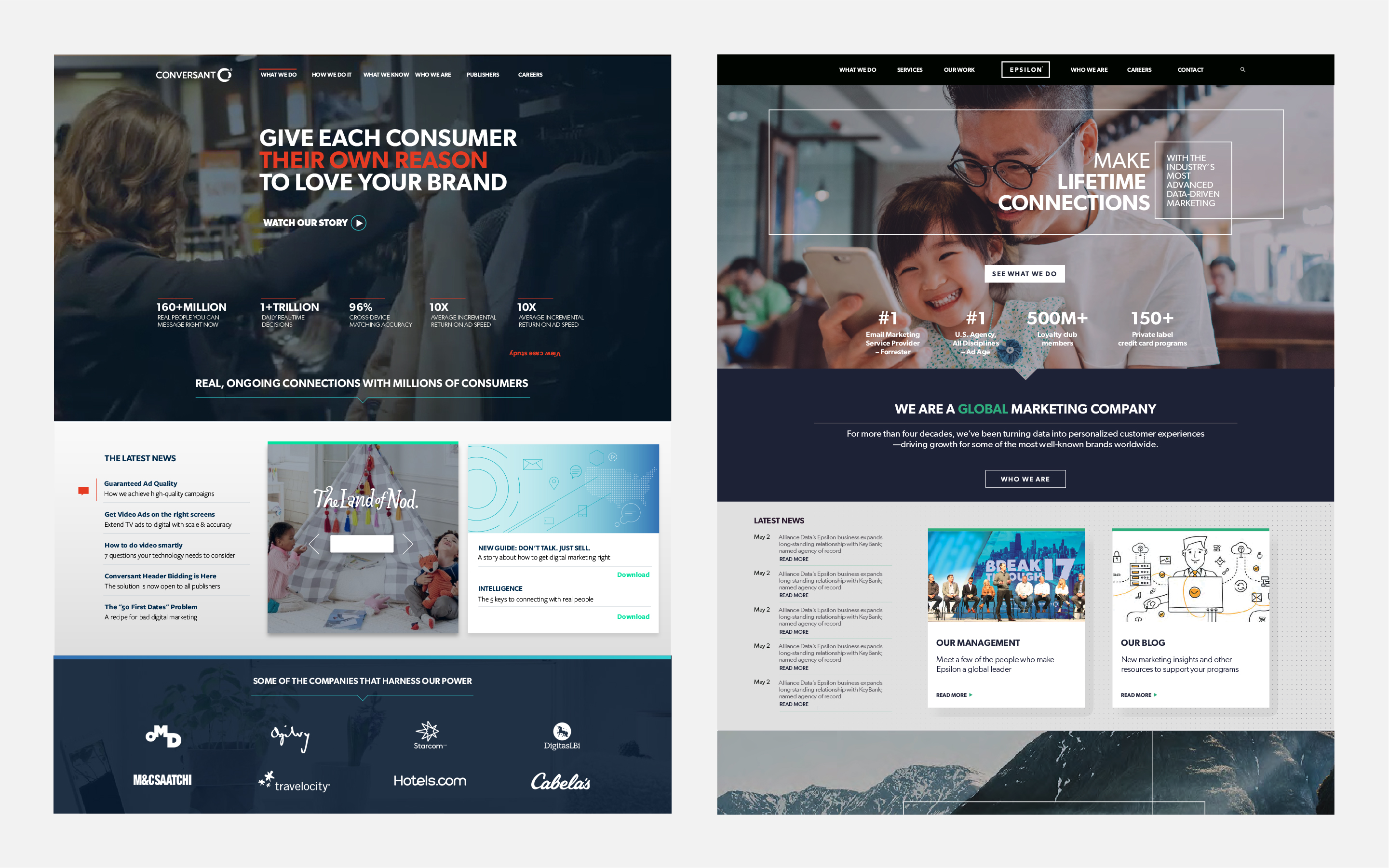
Two sister companies required to unify their digital properties. I was responsible to unify the visual language for both corporate websites,
including photography direction, illustration and typography.
branding
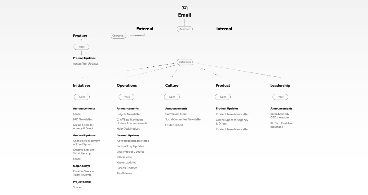
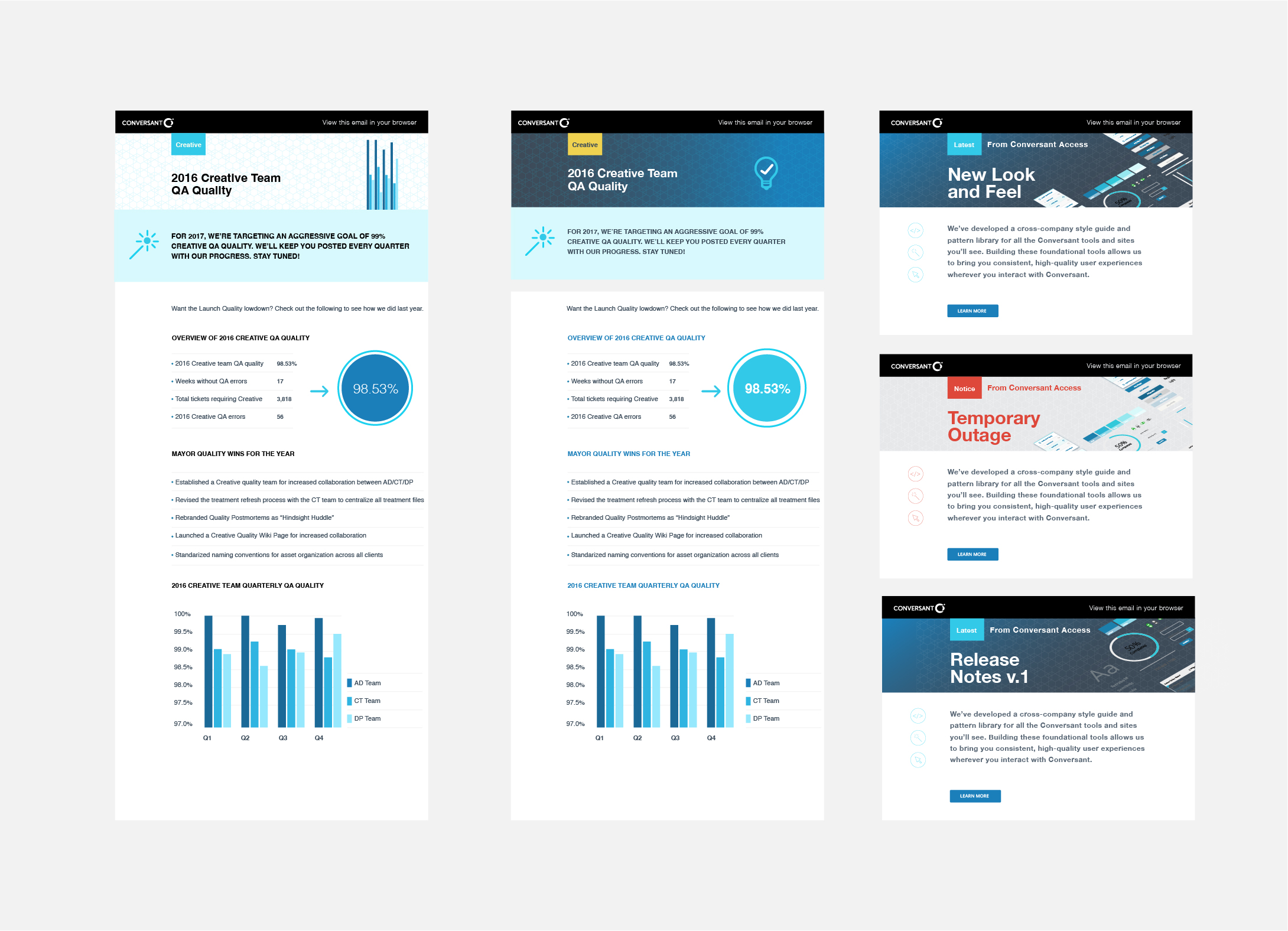
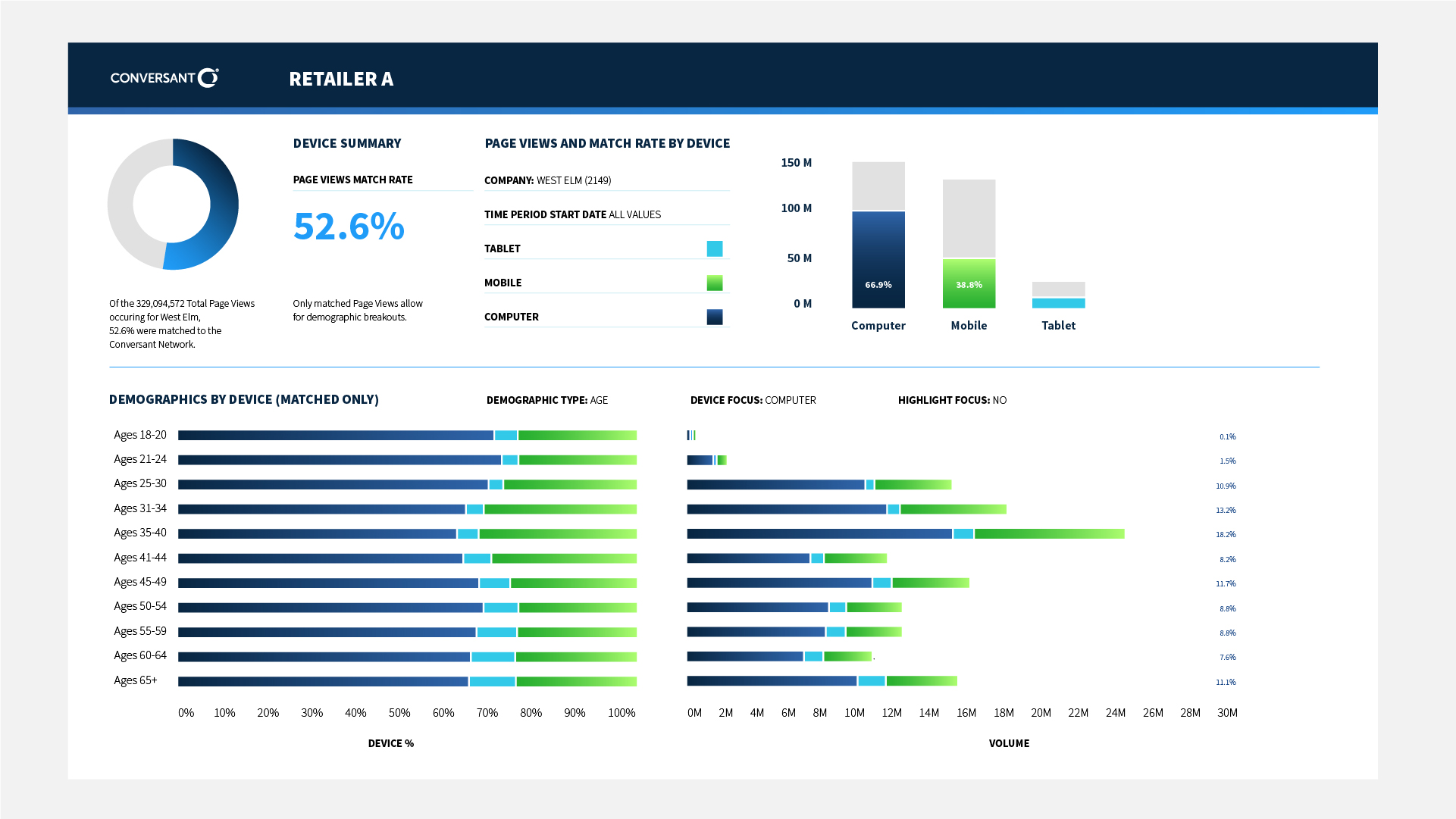
I was tasked with the responsibility of unifying the look and feel of two corporate websites including their flagship properties for the US presence. One of the primary issues identified at the very beginning would inform the process of establishing a global, sustainable and scalable approach for migrating, managing and maintaining the many unique digital properties under Epsilon with a lean team. The lack of visual cohesion and design standards broke the brand into regional, disconnected offshoots instead of strengthening the core brand. There was no central oversight on how the brand was supposed to be managed.

Two sister companies required to unify their digital properties. I was responsible to unify the visual language for both corporate websites,
including photography direction, illustration and typography.
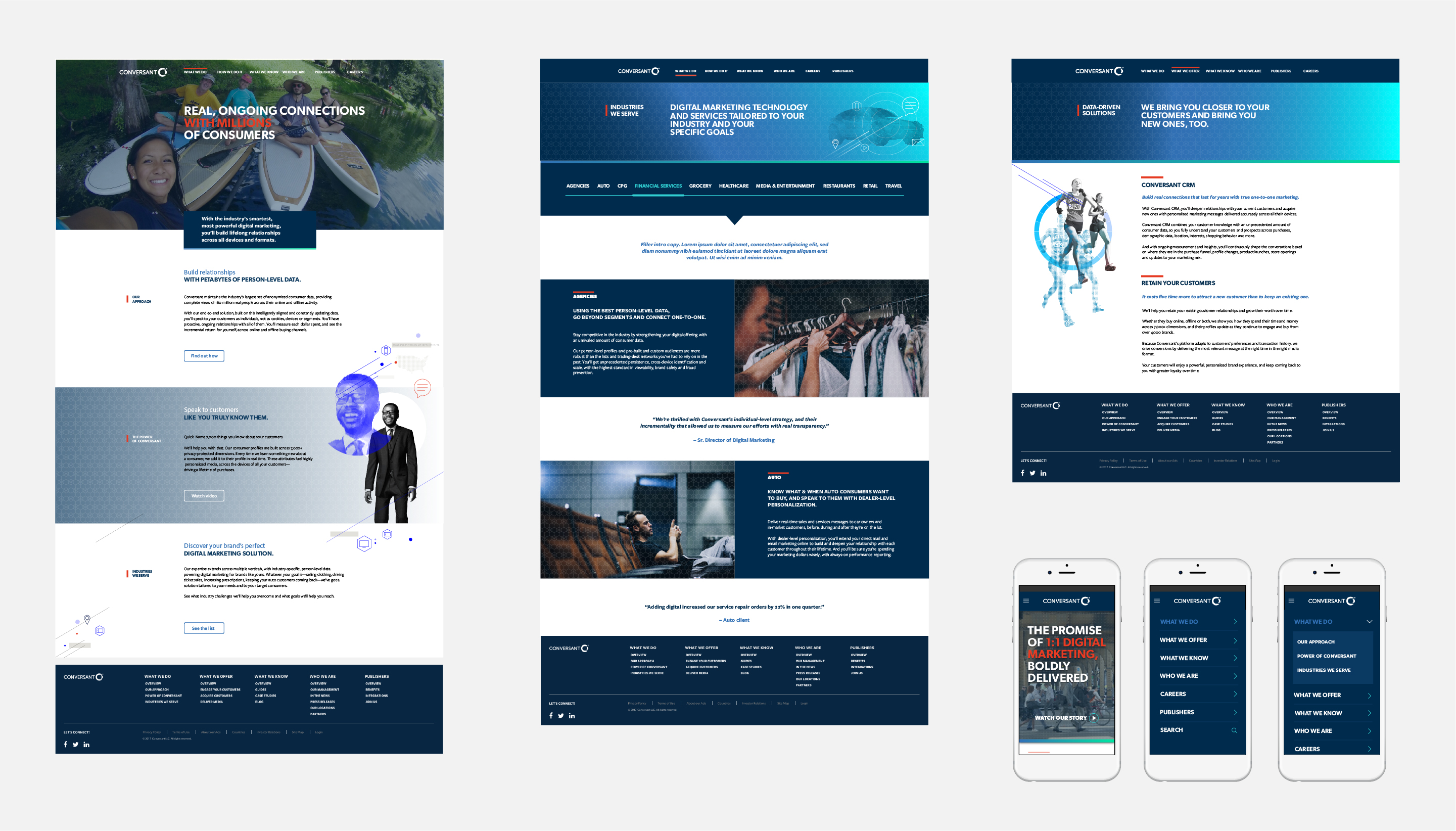
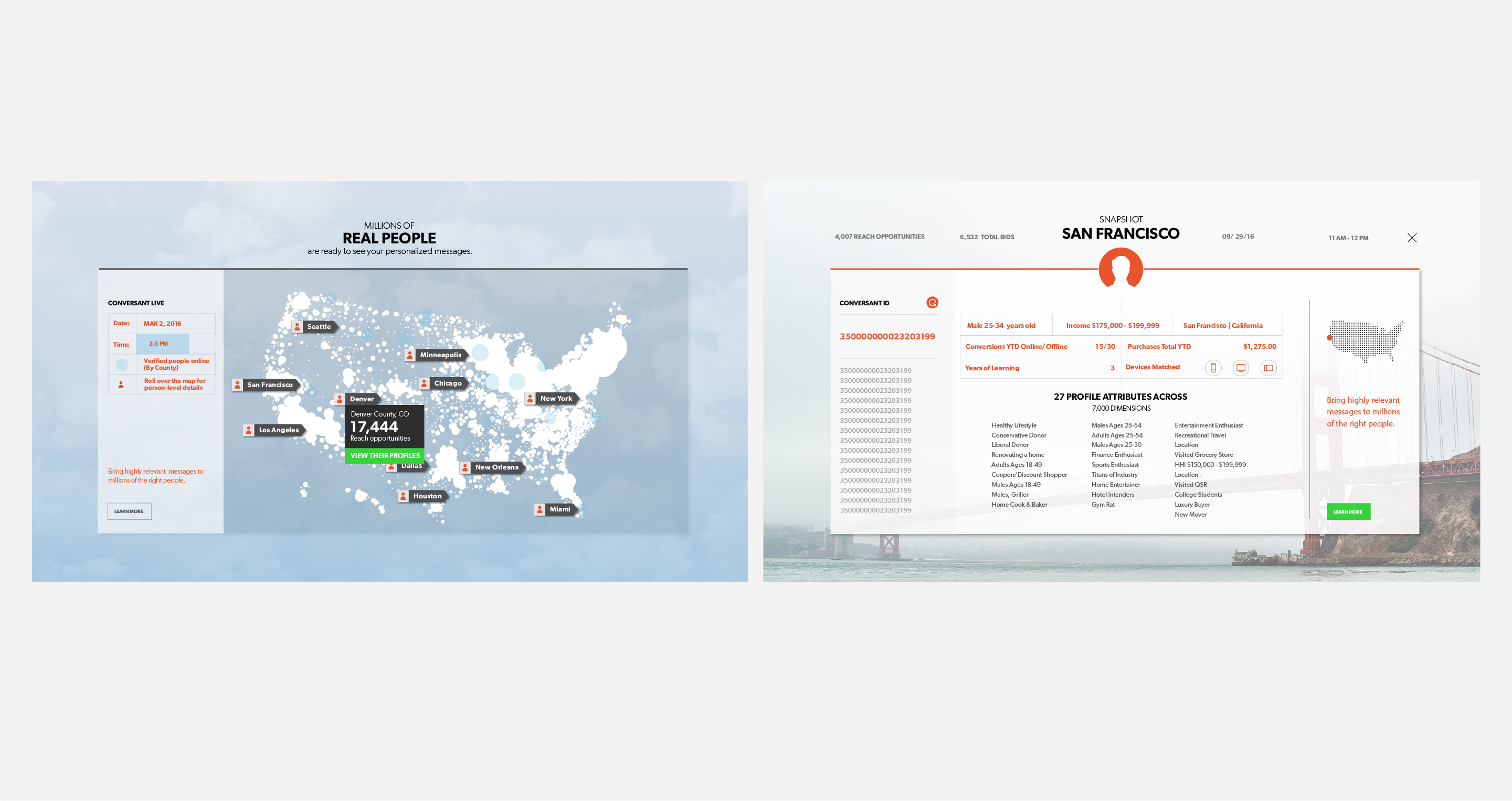
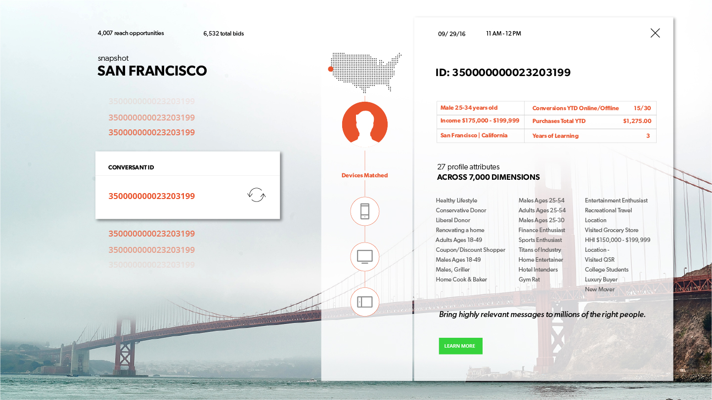
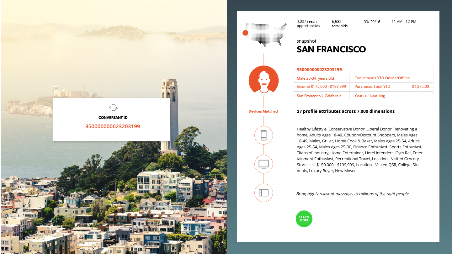
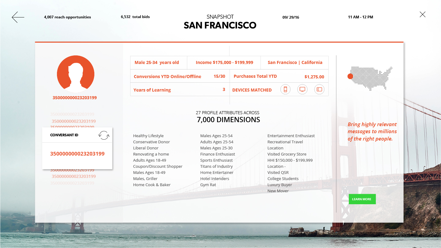
Different views for the Conversant website
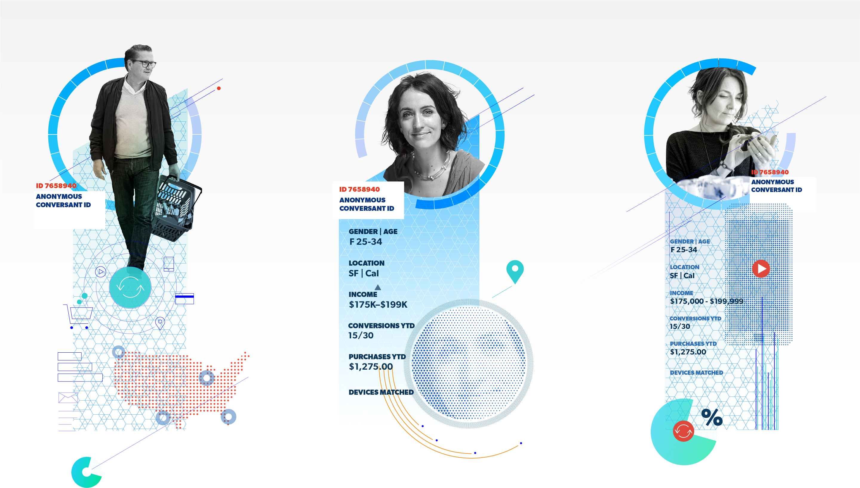
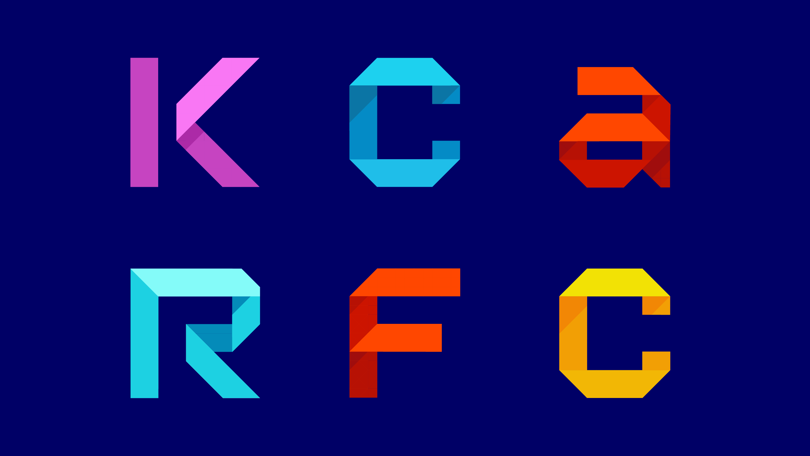
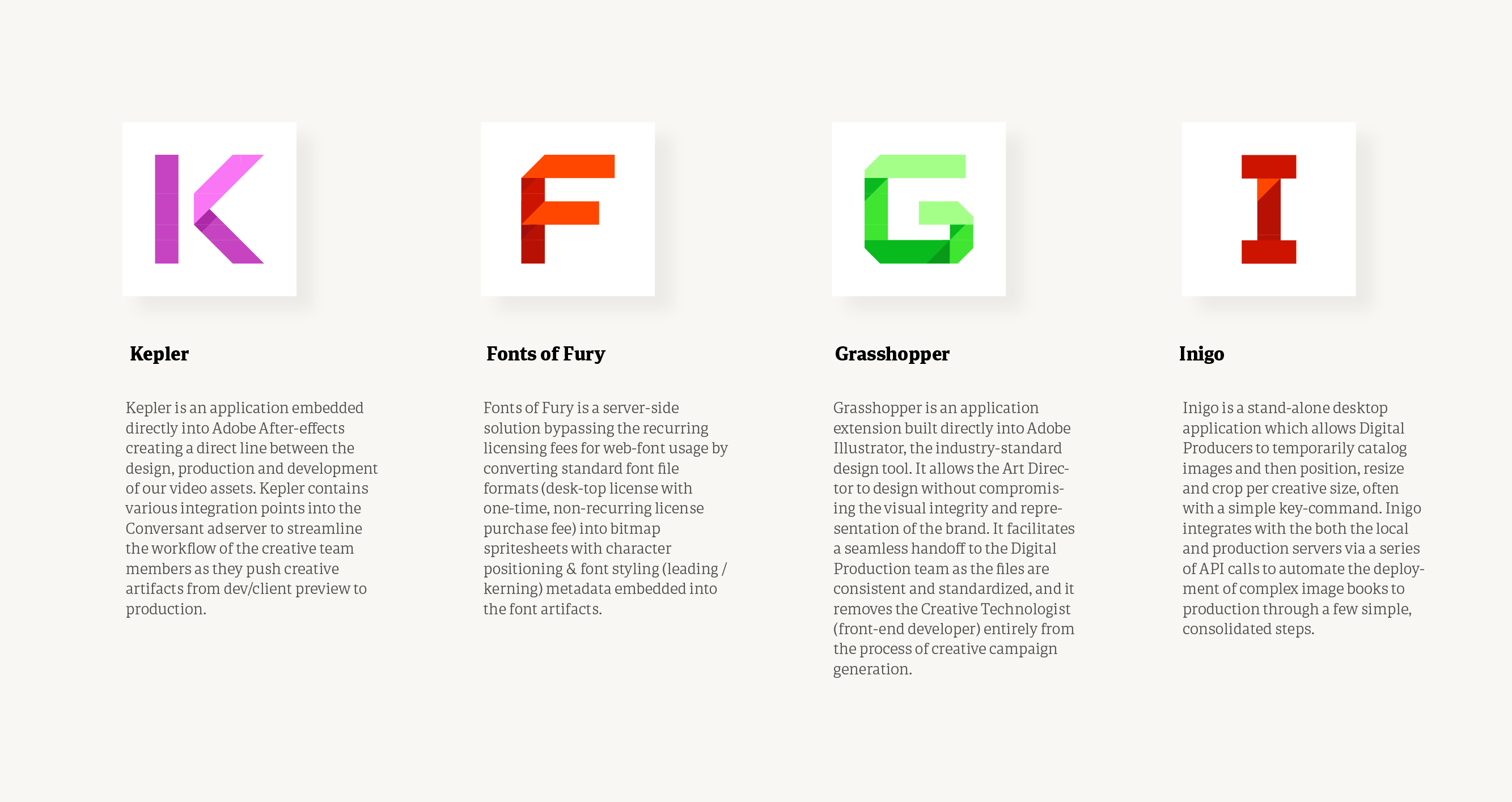
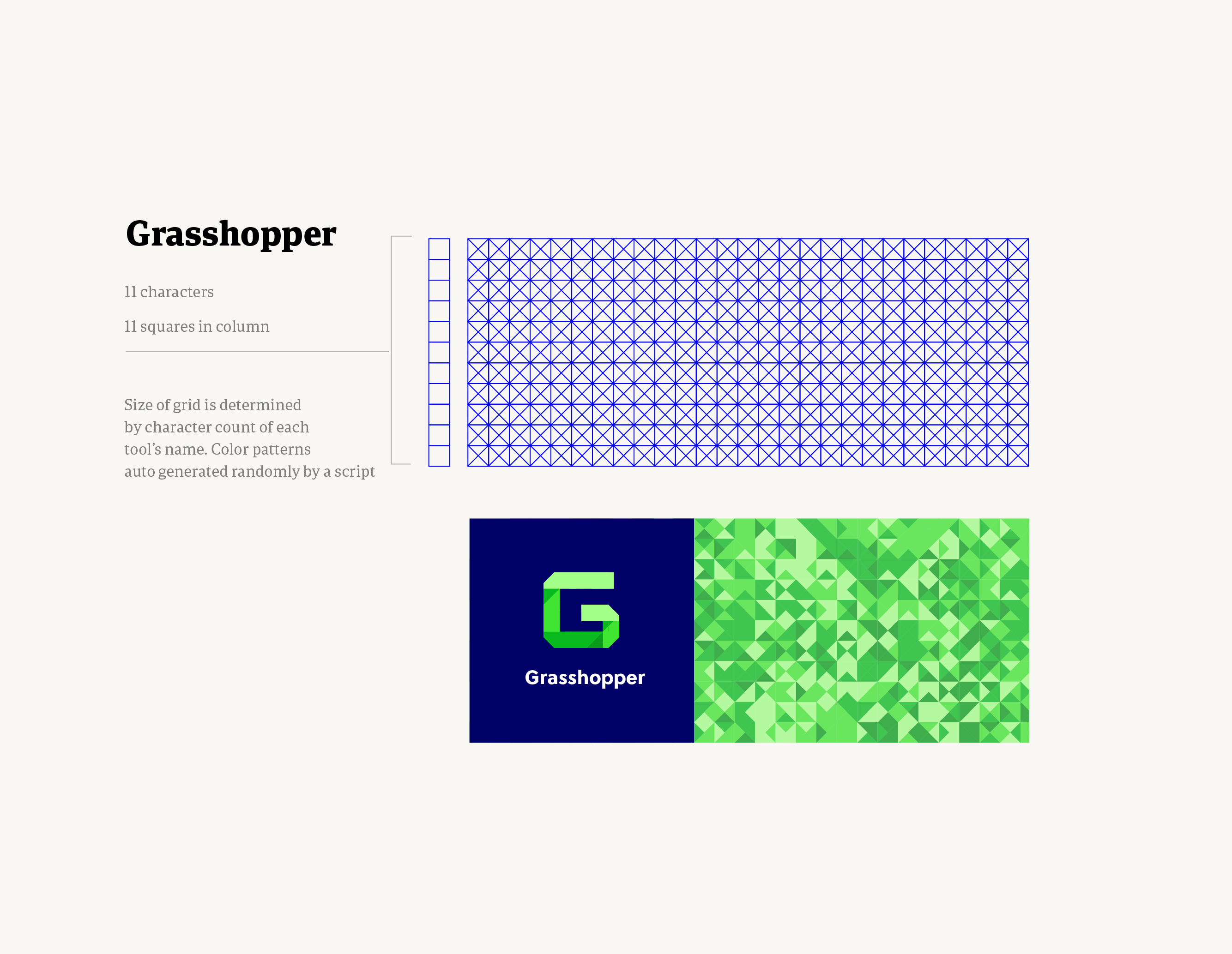
Illustration system for the Conversant website

Illustrations that express the granular quality of Epsilon’s and Conversant’s data oriented to provide marketers with unique attributes about their customers.
Lorem ipsum dolor sit amet, consectetur adipiscing elit, sed do eiusmod tempor incididunt ut labore et dolore magna aliqua.
Lorem ipsum dolor sit amet, consectetur adipiscing elit, sed do eiusmod tempor incididunt ut labore et dolore magna aliqua.
Lorem ipsum dolor sit amet, consectetur adipiscing elit, sed do eiusmod tempor incididunt ut labore et dolore magna aliqua. Ut enim ad minim veniam, quis nostrud exercitation ullamco laboris nisi ut aliquip ex ea commodo consequat. Duis aute irure dolor in reprehenderit in voluptate velit esse cillum dolore eu fugiat nulla pariatur.
Lorem ipsum dolor sit amet, consectetur adipiscing elit, sed do eiusmod tempor incididunt ut labore et dolore magna aliqua. Ut enim ad minim veniam, quis nostrud exercitation ullamco laboris nisi ut aliquip ex ea commodo consequat. Duis aute irure dolor in reprehenderit in voluptate velit esse cillum dolore eu fugiat nulla pariatur..
