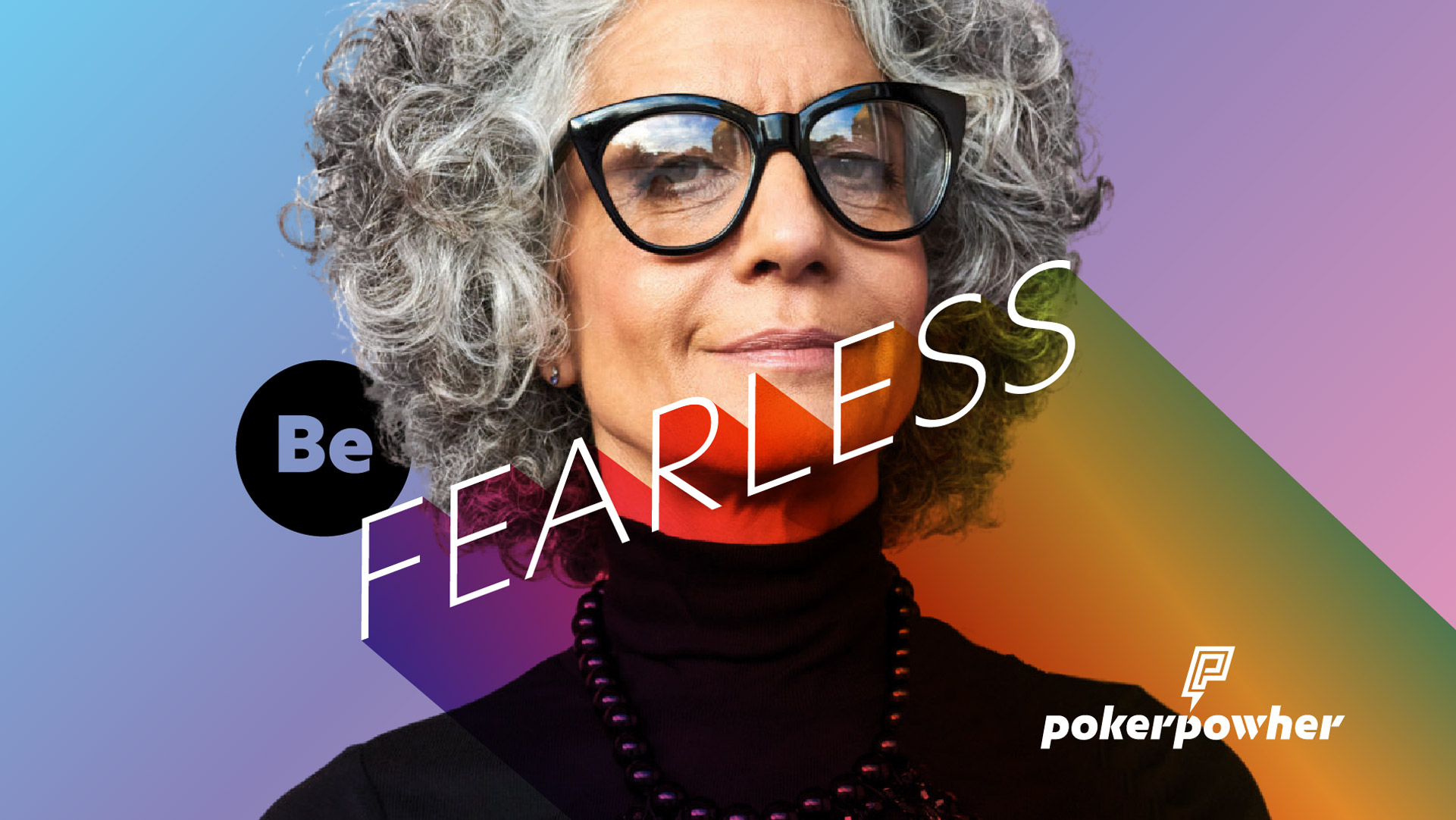
Poker Powher, designed fearless. Built to win.
Specifications
- Design direction
- UX/UI
- Motion direction
- Art direction
Poker Powher, designed fearless. Built to win.
Specifications
- Design direction
- UX/UI
- Motion direction
- Art direction
Specifications
Specifications
purpose

The program teaches women the strategic business skills: risk-taking, bluffing, knowing when to fold, that the workplace rarely hands them in advance.
It begins with typogra
The identity opens with a logo reveal, monogram and wordmark fused into one decisive mark. Versatile enough to scale from favicon to full canvas, but never split apart. Every application carries the same conviction: there's always a place for every player.
The wordmark is set in Orientation, a geometric typeface born for physical wayfinding. As weight increases, letterforms grow abstract and push legibility to its edge. In context, they hold. That tension between structure and boldness makes it a perfect fit for a brand that plays at every table.


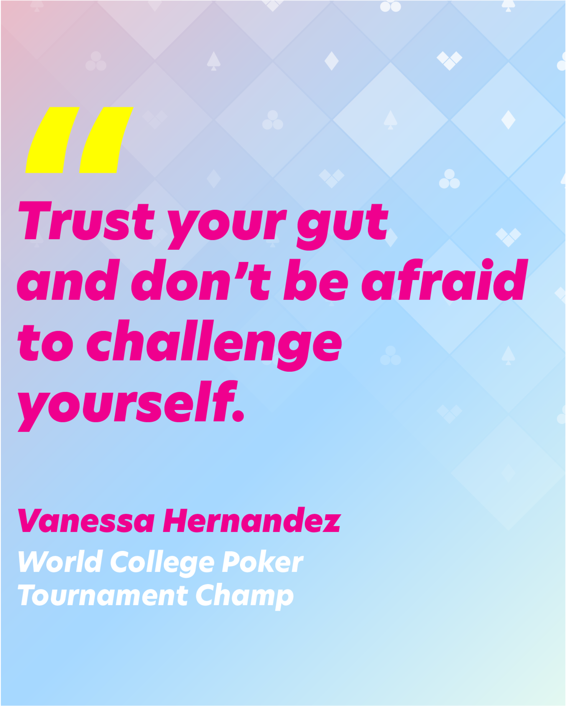
Three distinct women, one shared ambition. The HR executive shaping corporate culture. The Fortune 2000 climber hungry for an edge. The college student who hasn't hit the table yet. Each arrives with different stakes — all leave with the skills, community, and confidence to win.

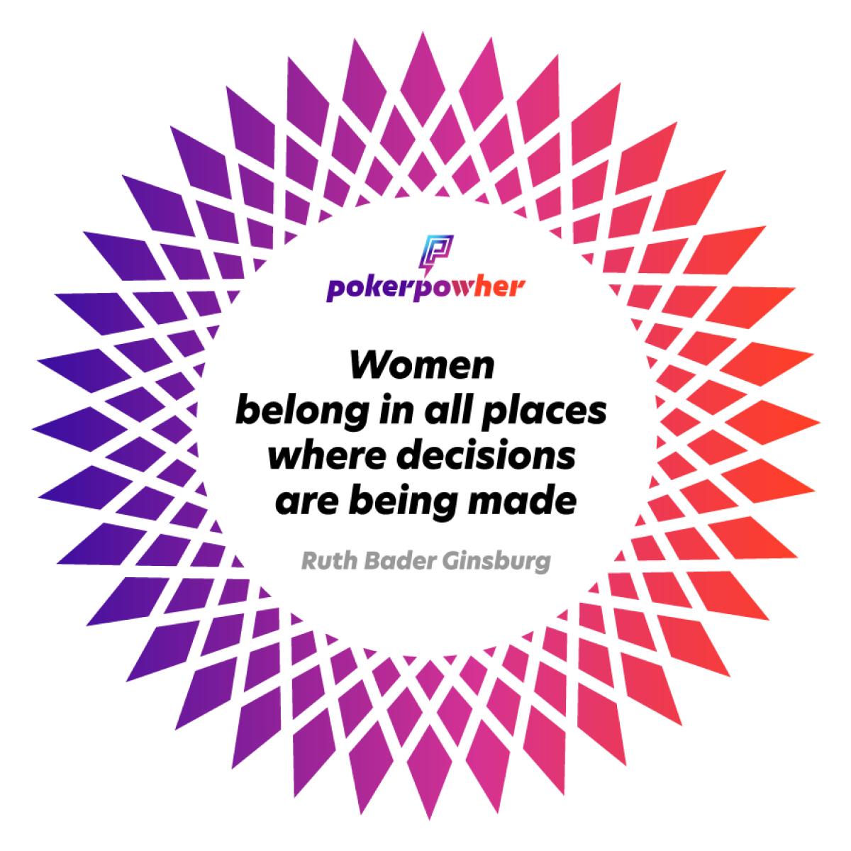
Poker Powher is fearless, unapologetic, and magnetic — built for women who came to win. Bold without arrogance. Real without cruelty. Inviting without coddling. The brand lives at the intersection of fiery conviction and radical inclusivity. Every woman gets a seat. Nobody plays it safe.

The brand speaks with the confidence of someone who already knows they'll win. No passive language, no sugarcoating, no apologies. Active, direct, and inclusive — the tone moves from the classroom to the boardroom without missing a beat. The poker table is every table. Poker Powher came to flip it.


Translating identity into interaction, and turning a poker app into a platform for fearless women.

The visual identity translates without compromise into the app. The full-spectrum color system, bold typography, and diamond-grid motifs carry from campaign to screen, creating a single, coherent world. Every interaction feels like the brand: fearless, direct, and built for women who came to play.

The interface puts Texas Hold'em at the center and strips away everything else. Practice against bots, join open tables, or sit with an instructor at a Teaching Table. Every hand builds the same skills the brand promises, risk assessment, decision-making, and the confidence to go all in.

The app extends the brand into a living network. Premier members connect with instructors and fellow players beyond the table. Game scheduling, community games, and daily inspirations keep women engaged, accountable, and growing from the first lesson to the final table.


brand in the wild
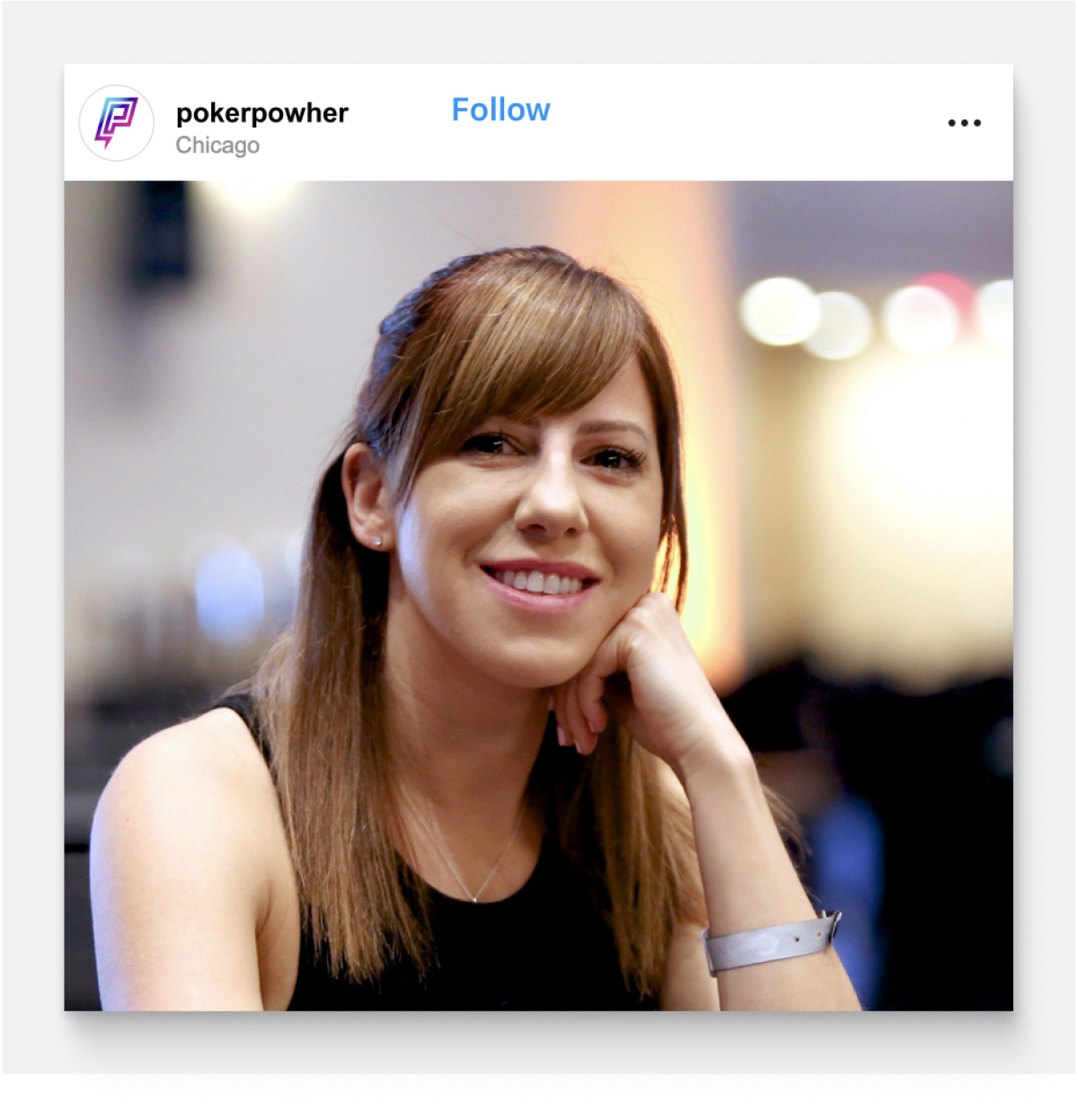
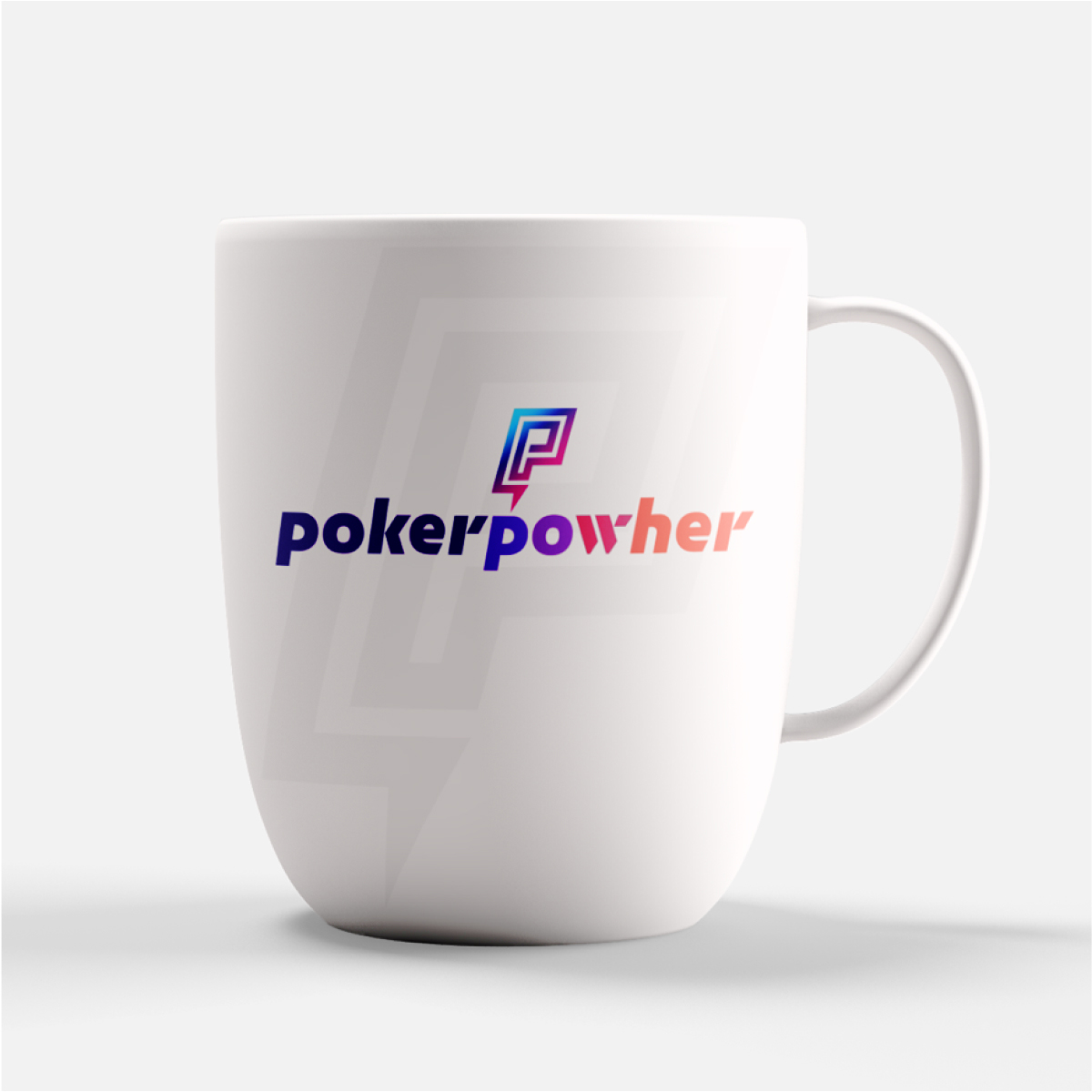
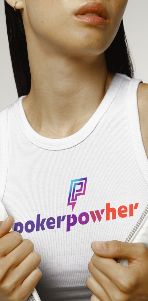
Consistent, fearless, and unmistakable. The identity was built to travel: from corporate one-pagers to Zoom backgrounds, from app launch screens to swag that women actually want to wear.


Results


Immersive social