Specifications
Specifications
brand positioning
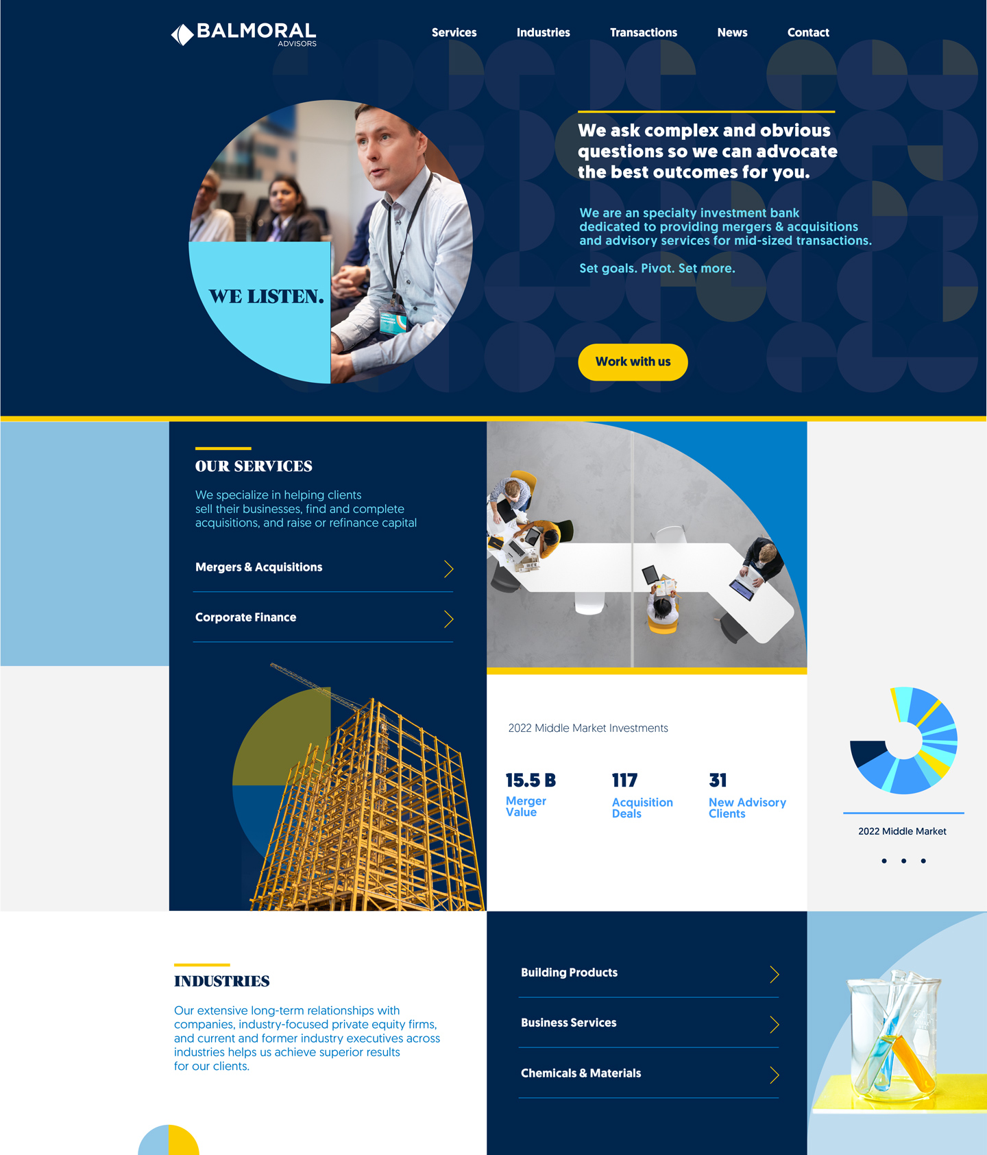
The firm needed a brand identity that conveyed their client-first approach, deep expertise, and unwavering commitment.


Look for an advisor that makes you say "wow"
strategy

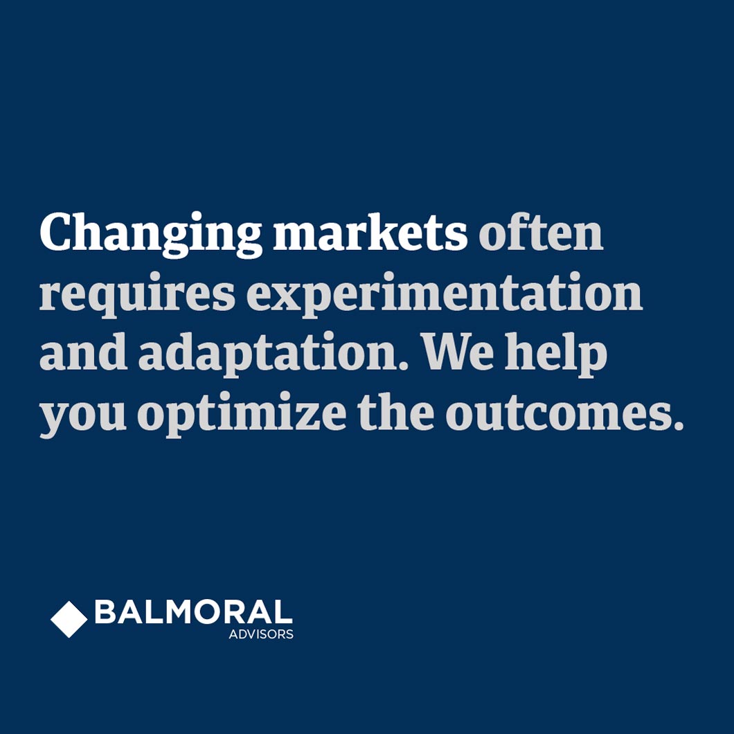
Balmoral Advisors guides middle-market companies through complex transactions. The rebrand established a visual identity that mirrors their client-first philosophy: deliberate, refined, and built on integrity rather than flash. The result elevates middle-market investment banking through understated confidence.
Balmoral is truthful, decisive, and meticulous. They pursue outcomes through resourceful thinking and problem-solving. Where others hedge, Balmoral commits. Where competitors create obstacles, they clear the path. Trust earned through action, delivered without compromise.

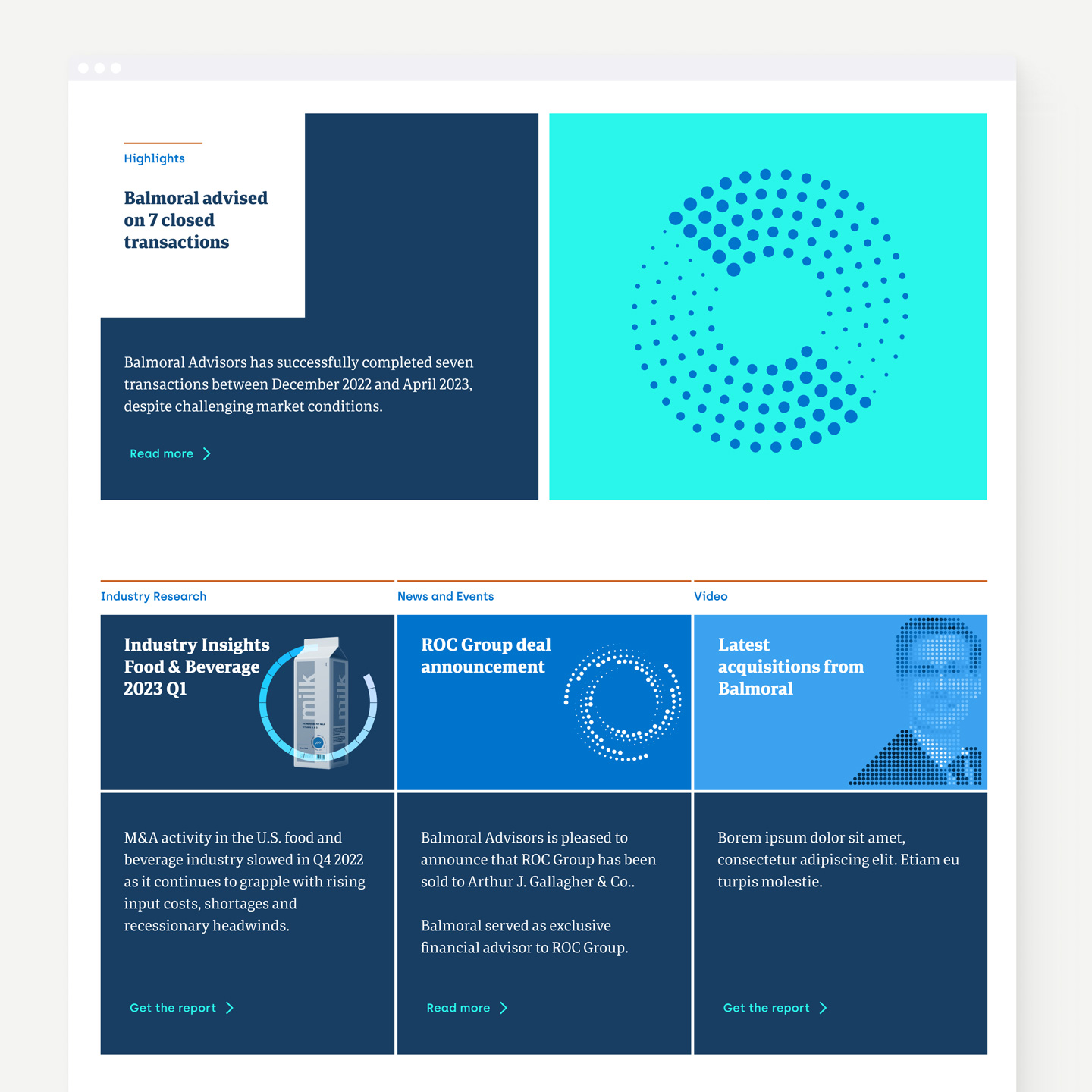
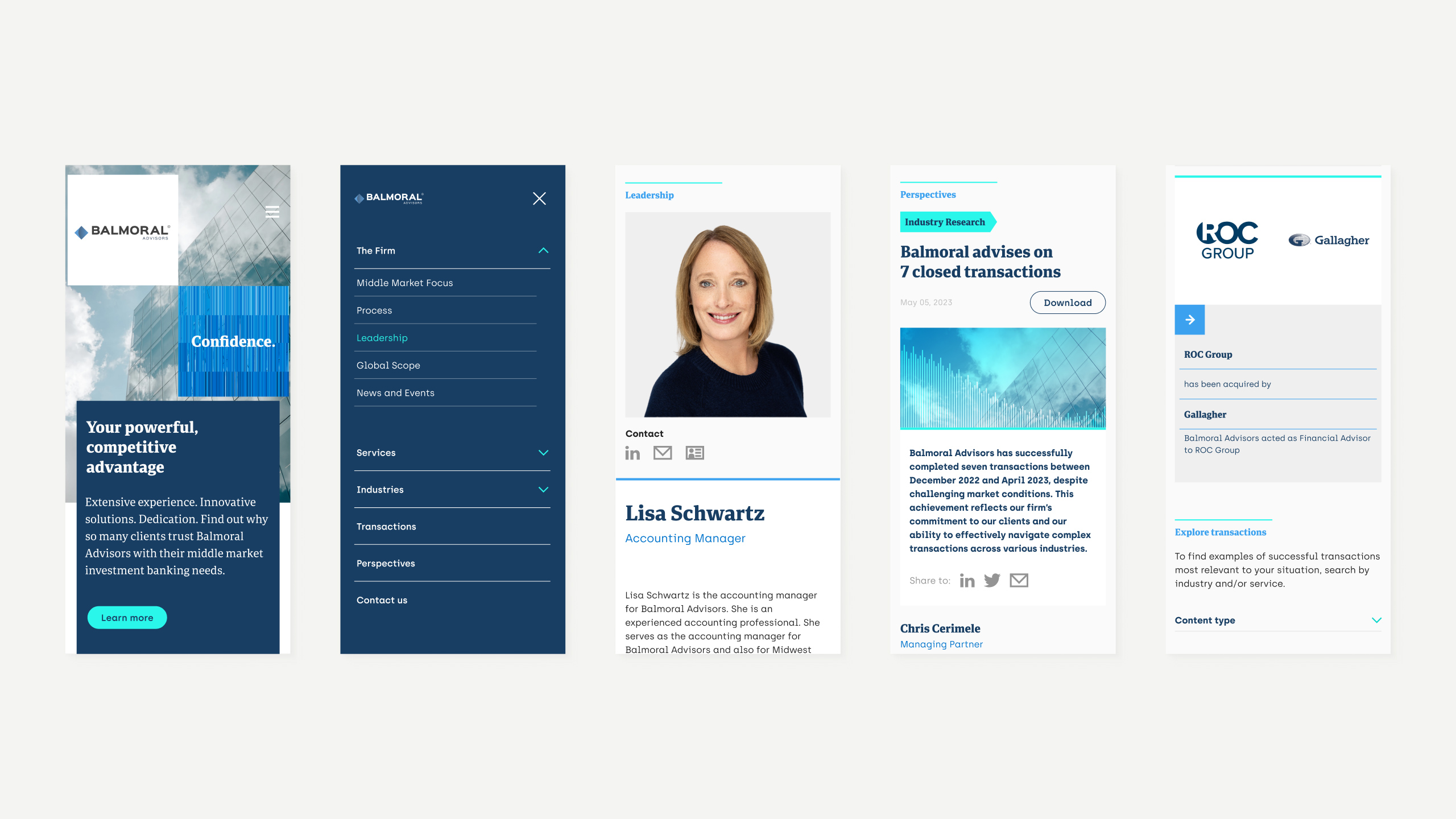
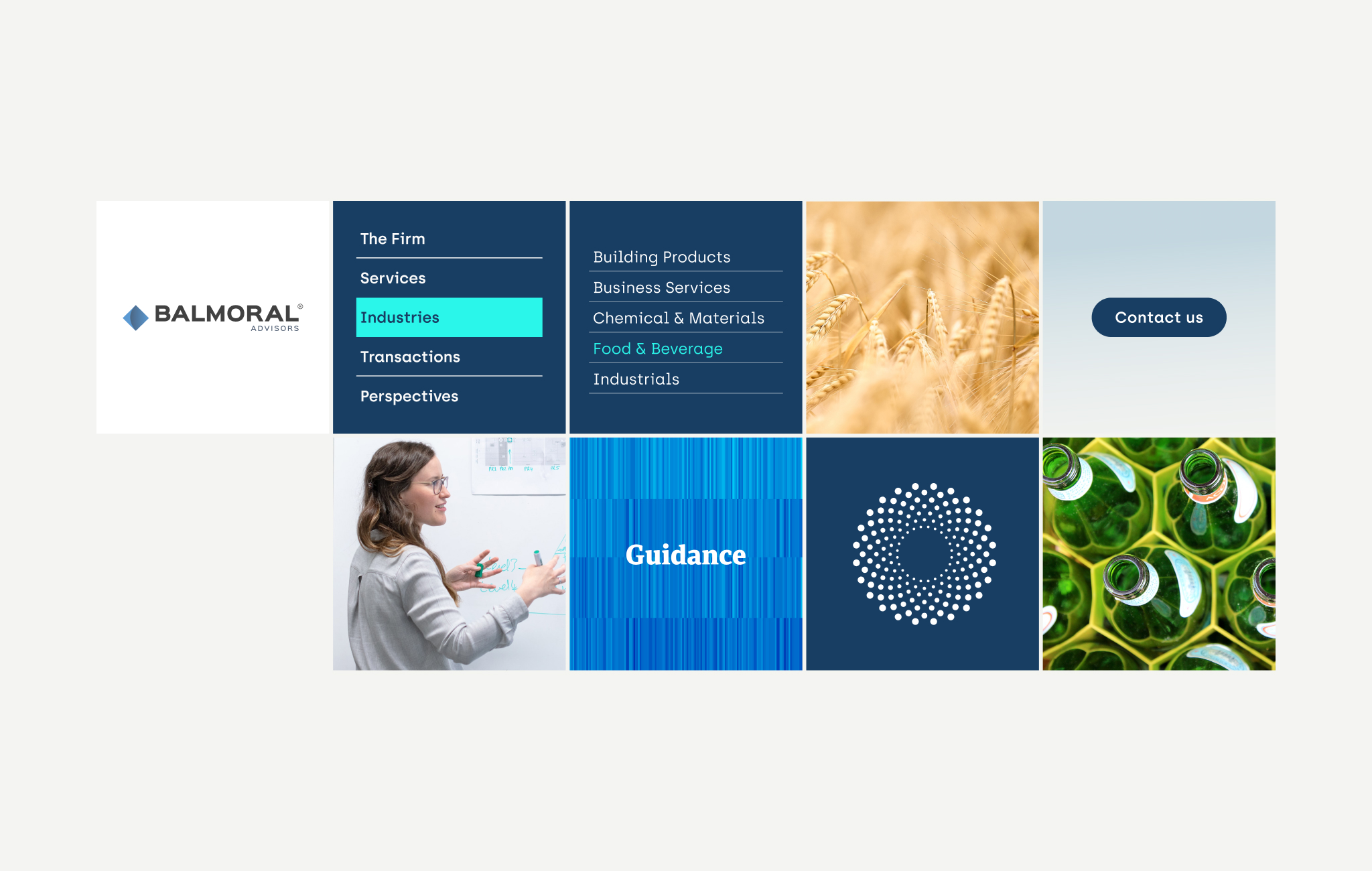
The grid system acts as a structural backbone across the entire site. Modular, repeatable, efficient. From the homepage's card-based content sections (Services, Industries, Transactions, News) to the leadership page's team layout, the grid maintains visual consistency without feeling rigid.
This approach scales content types cleanly. Whether displaying transaction portfolios, industry expertise areas, or thought leadership reports, the grid adapts while preserving brand coherence. Design as infrastructure: invisible when working well, critical for maintaining professional credibility across dozens of pages and content types.

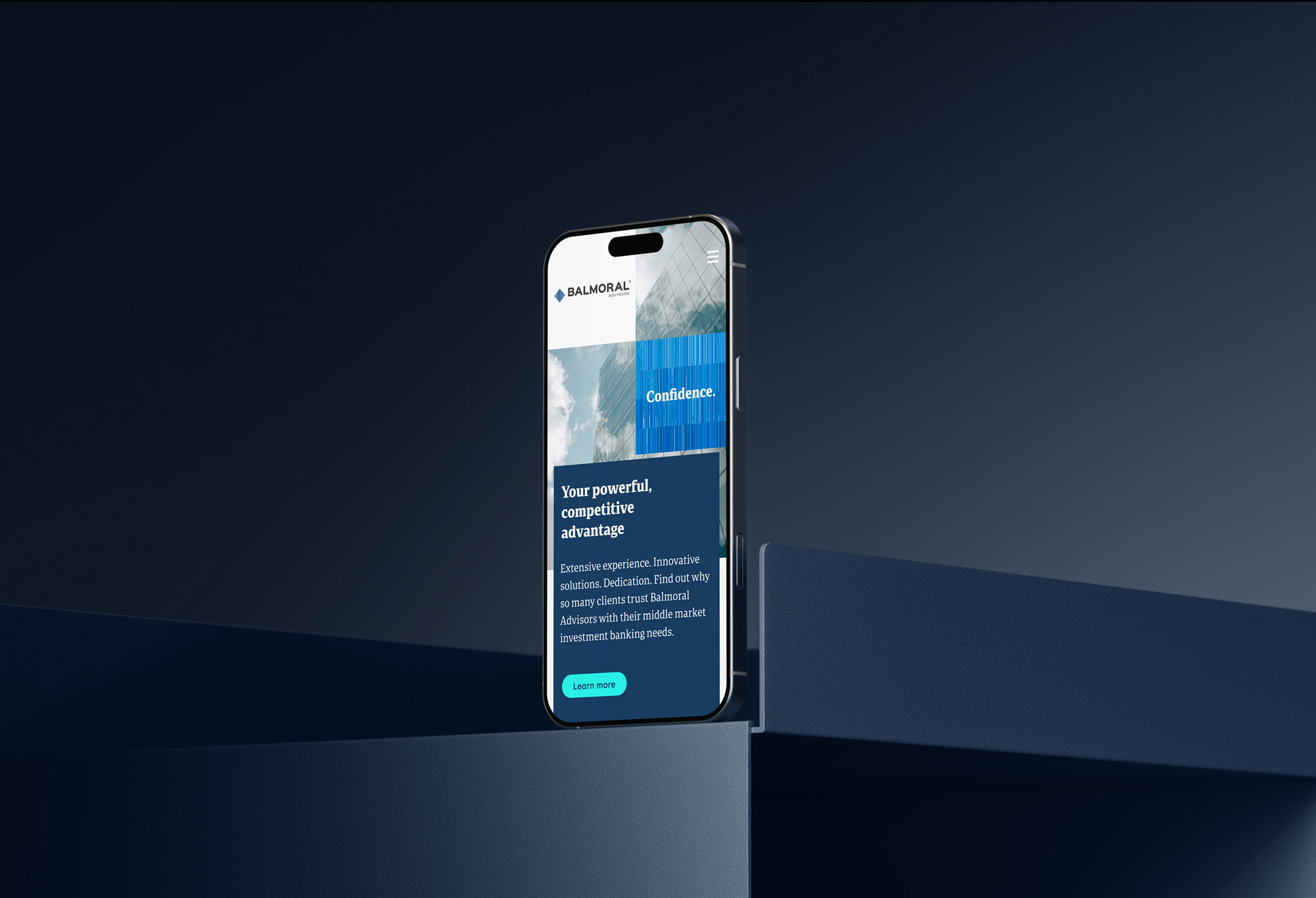
Responsive
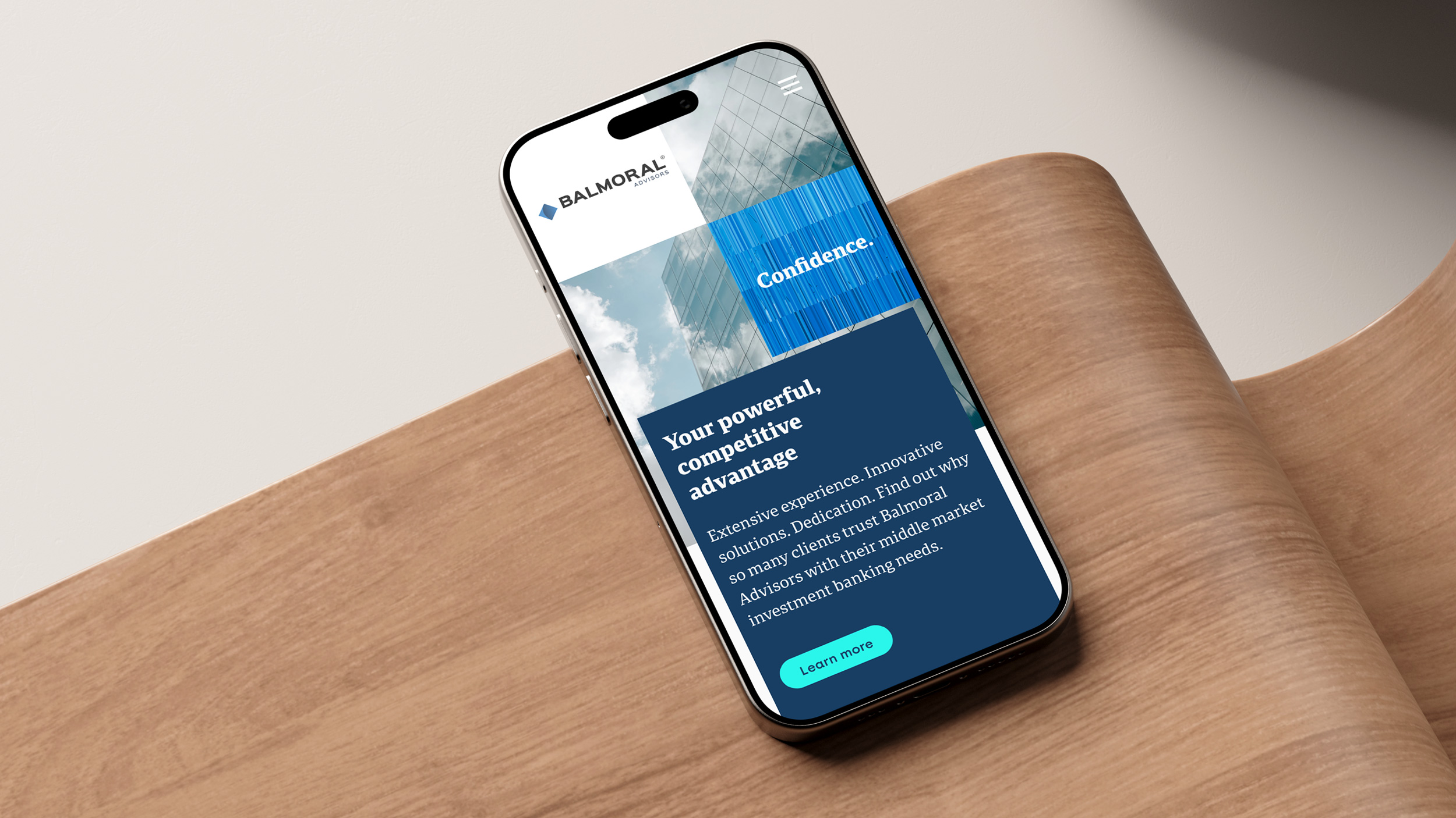
The mobile experience does not feel like a compromise. The cyan accent color pops on smaller screens. Breathing room between elements prevents cognitive overload. Critical actions (contact links, downloads, transaction exploration) stay accessible. The grid proves its value: content organized on desktop stays organized on mobile, reoriented for thumb navigation.
Modules
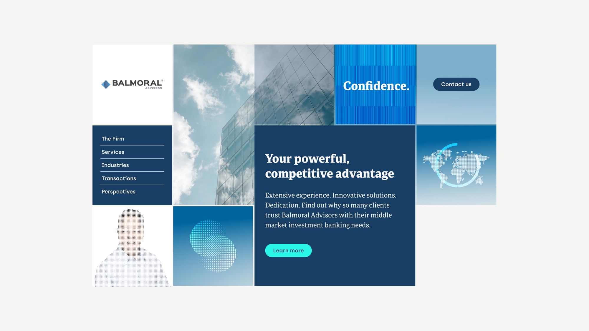
The headline system nails the fundamentals—short, declarative, client-focused statements that work across every touchpoint. This consistency builds trust through repetition and creates a recognizable voice.


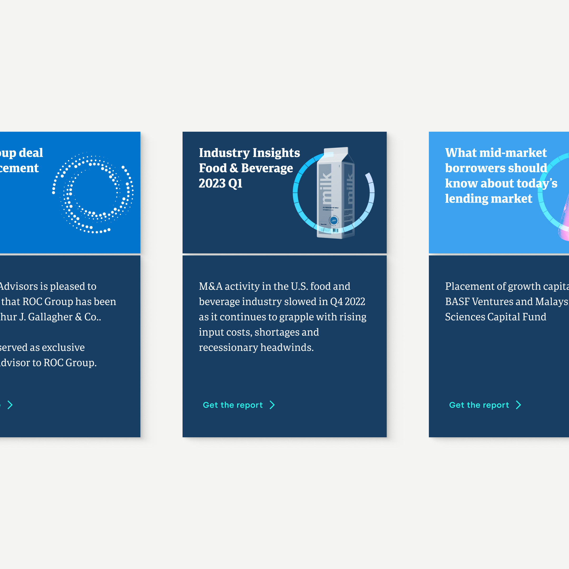
The Perspectives section operates as Balmoral's publishing arm: liquidity reports, industry insights, and transaction announcements presented with editorial discipline. Bold headlines, date stamps, visual anchors, excerpts, and CTAs treat each piece like a feature article.
The design choice reveals strategy. Framing proprietary market intelligence as editorial content positions Balmoral as the authority clients seek for answers, not pitches. The consistent grid (headline, visual, excerpt, action) makes complex financial analysis approachable without diluting expertise.
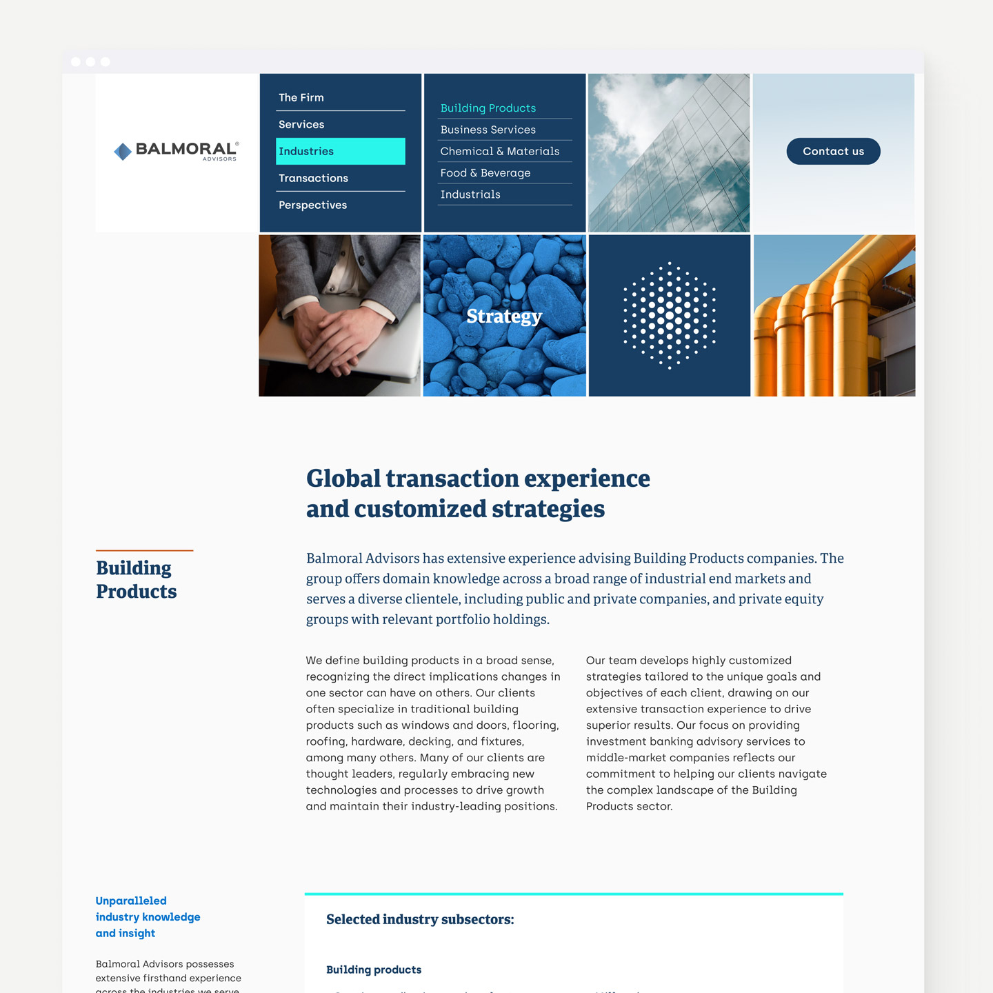
Cards
Cards function as the site's universal container. Team bios, transaction tombstones, industry expertise, and thought leadership all use the same structure. This consistency creates instant readability: users know how to parse information on sight.
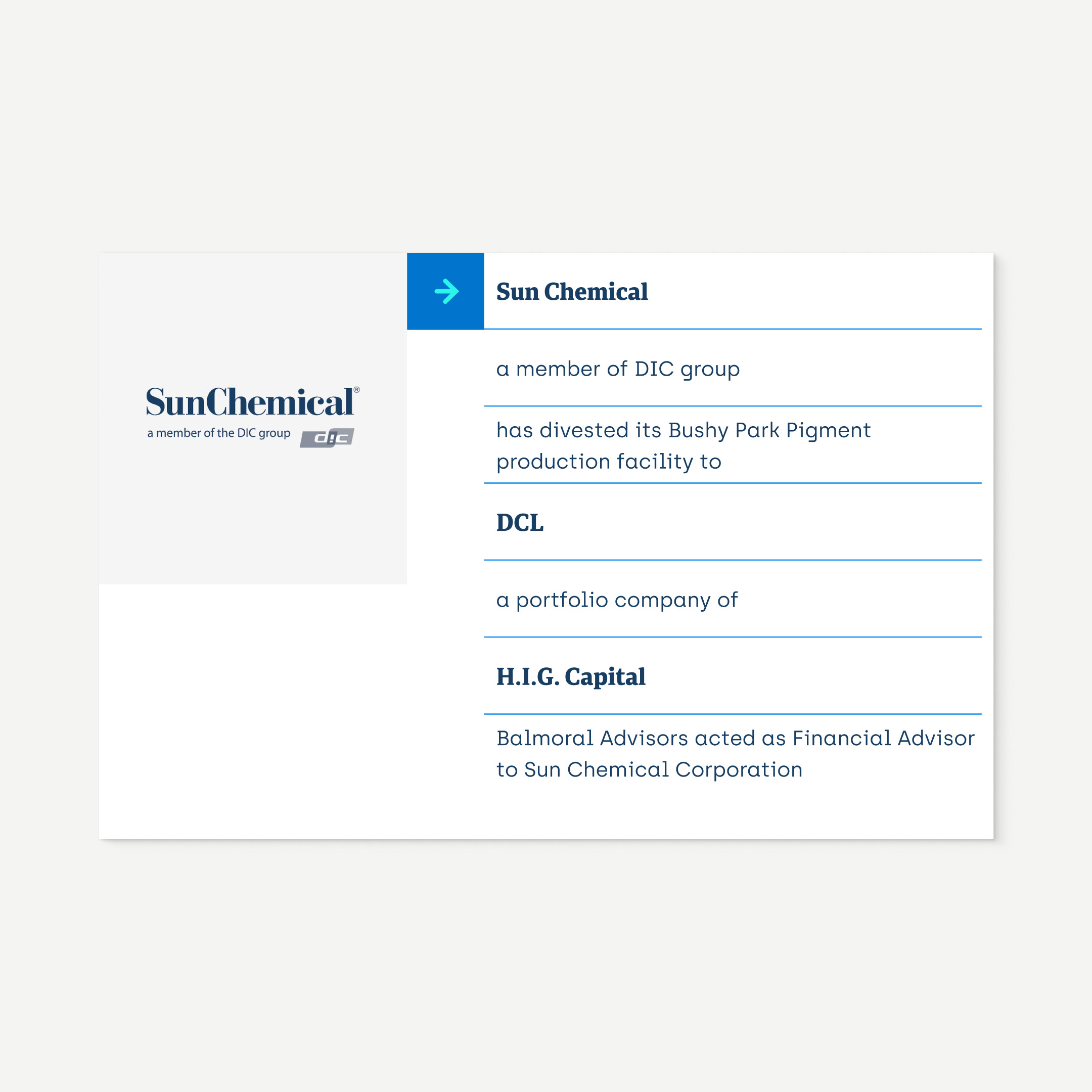
Cards consistently structure tombstones, creating rhythm and fast scanning. Their uniform format reinforces credibility and supports comparison. Users quickly recognize deal types, industries, and advisory roles with minimal cognitive load.
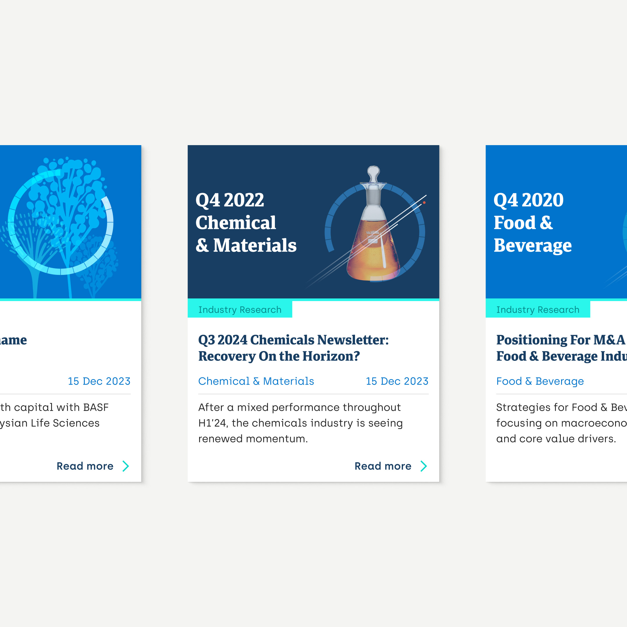
Industry expertise cards translate complex focus areas into digestible snapshots. Their consistent structure supports quick sector recognition, helping users identify relevance and authority while maintaining a professional rhythm across pages.

Two directions were fully developed with the same conceptual approach but different expression. The examples show the direction aligned with the existing visual identity (Legacy logo) and the new positioning for the company.


Syniverse