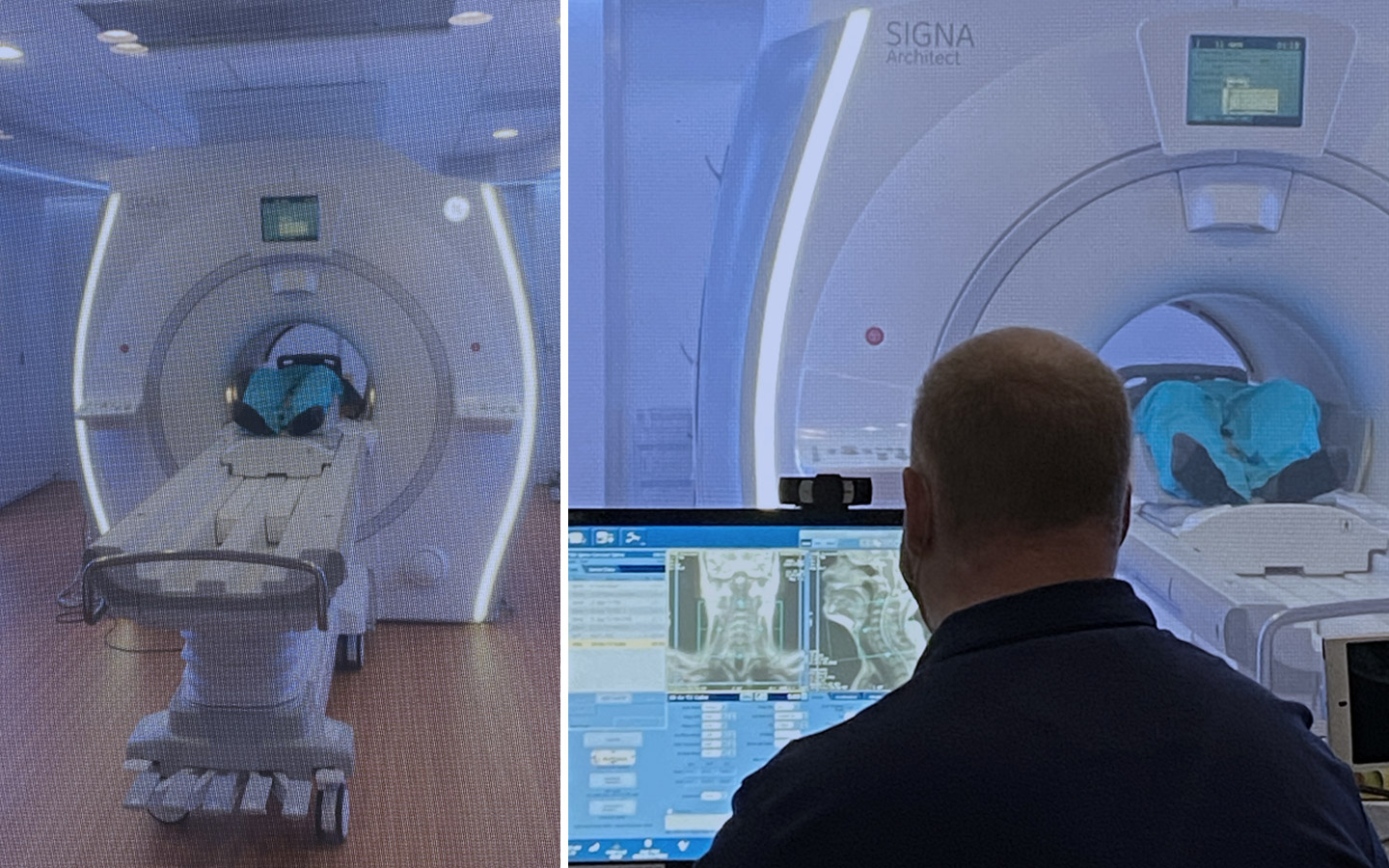
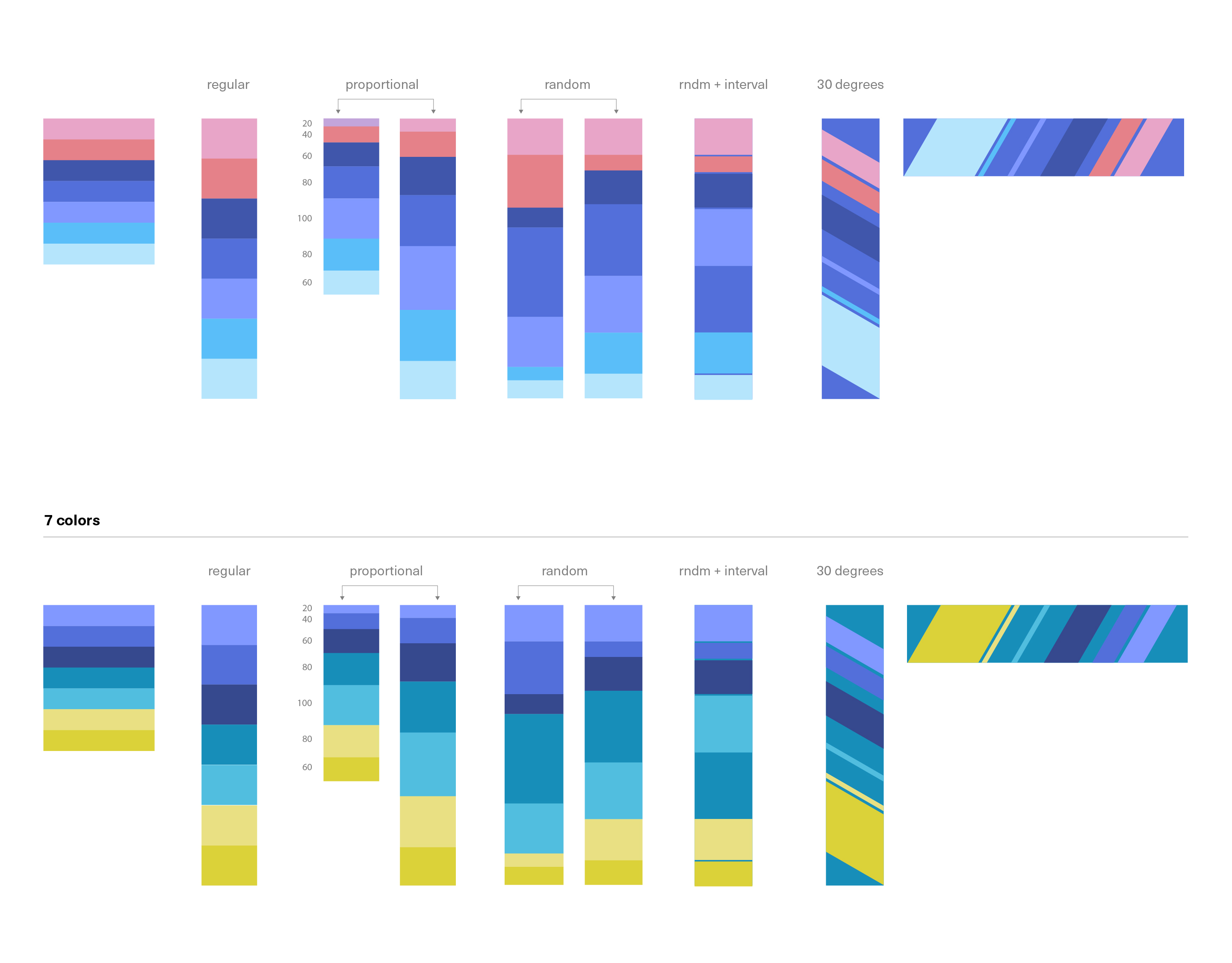
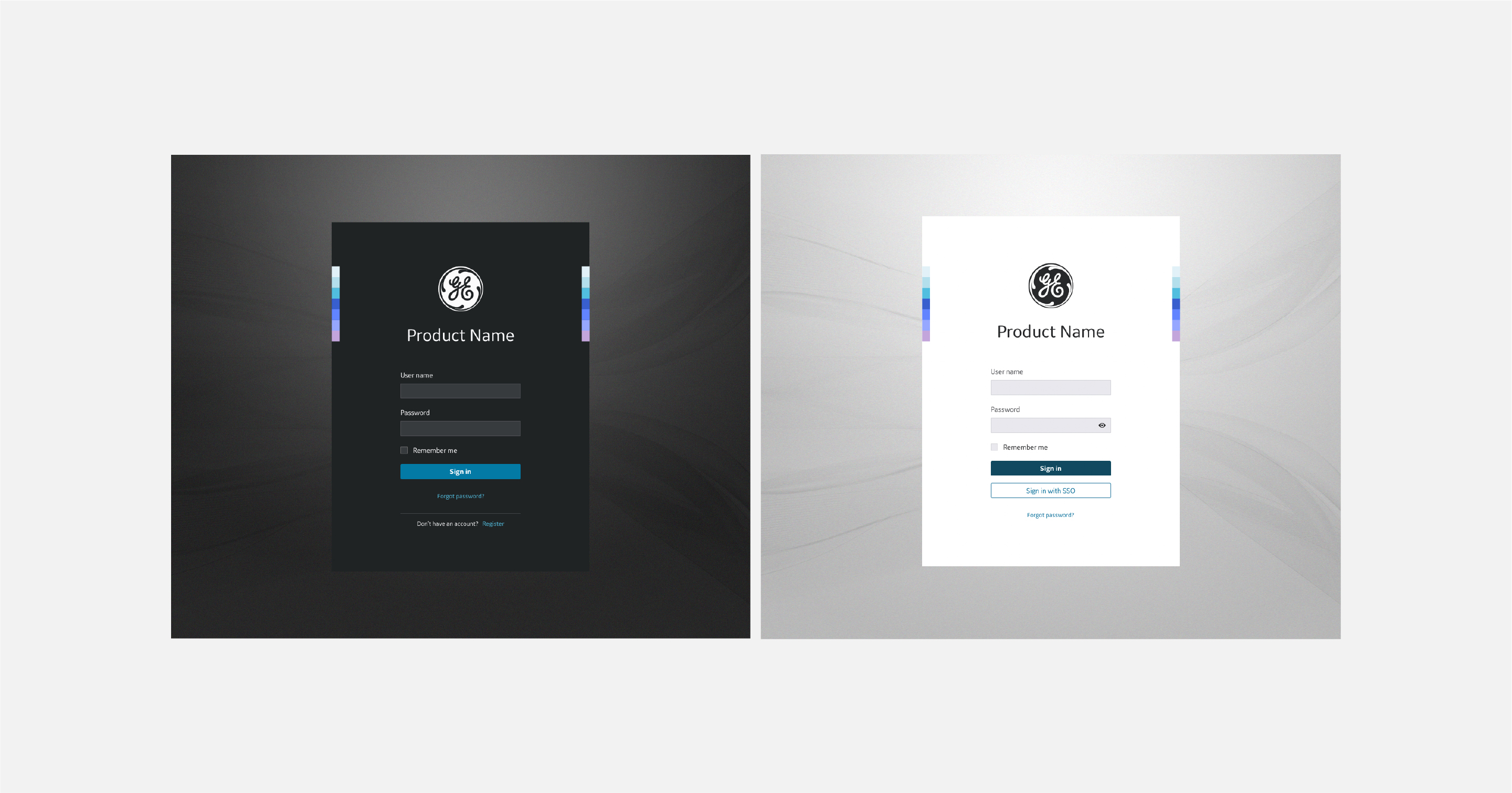
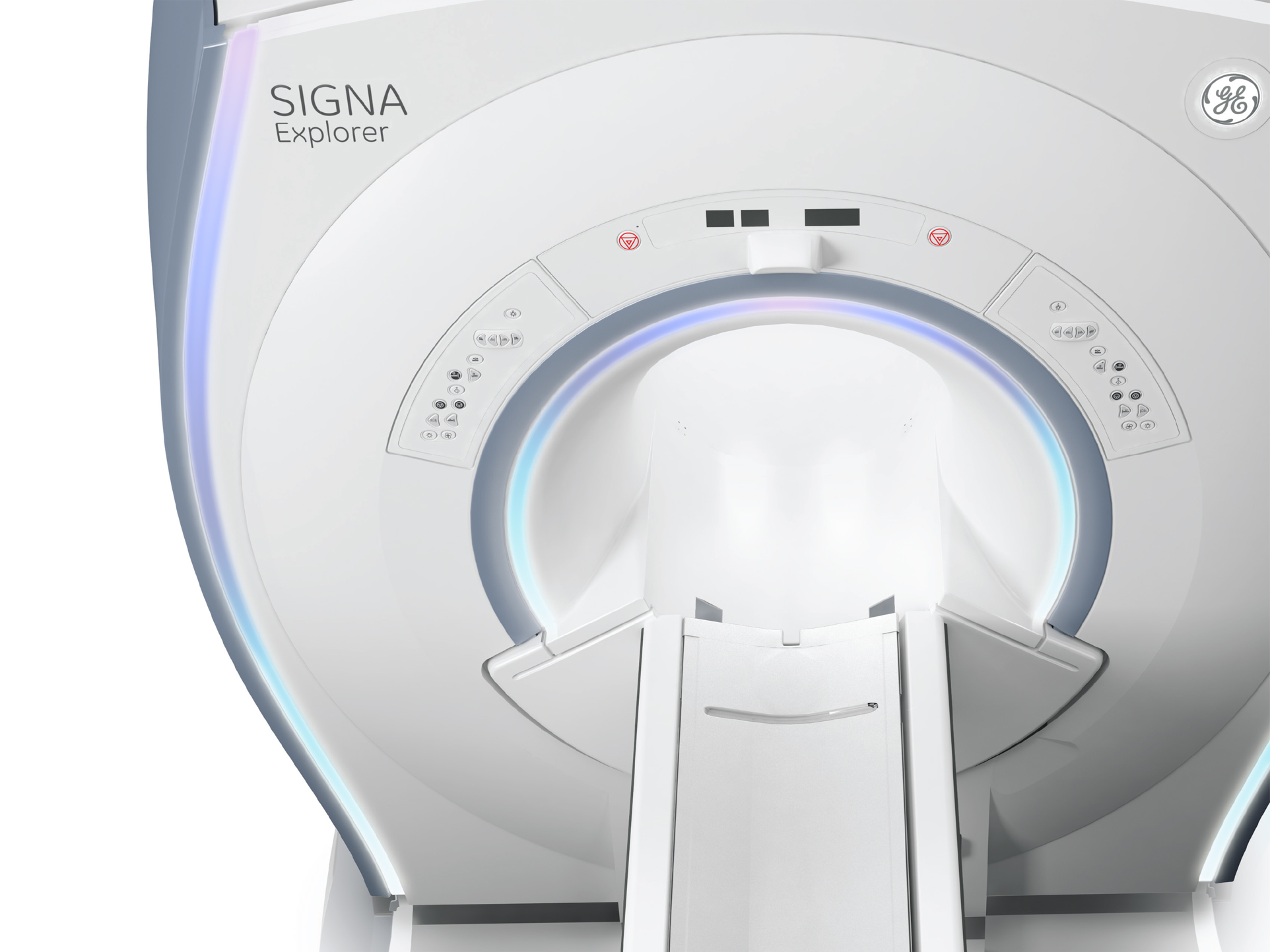
branding

How do you unify hardware & software into one cohesive expression?

The goal is to unify a cohesive Design Language between physical products (new versions for healthcare equipment) and software, incorporating a key visual into the existing Design System.
The challenge was to match different color palettes, from corporate and product lines into the existing one for the Edison Design System.

  • Role: ACD
  • Discipline: Branding | UI

The concept

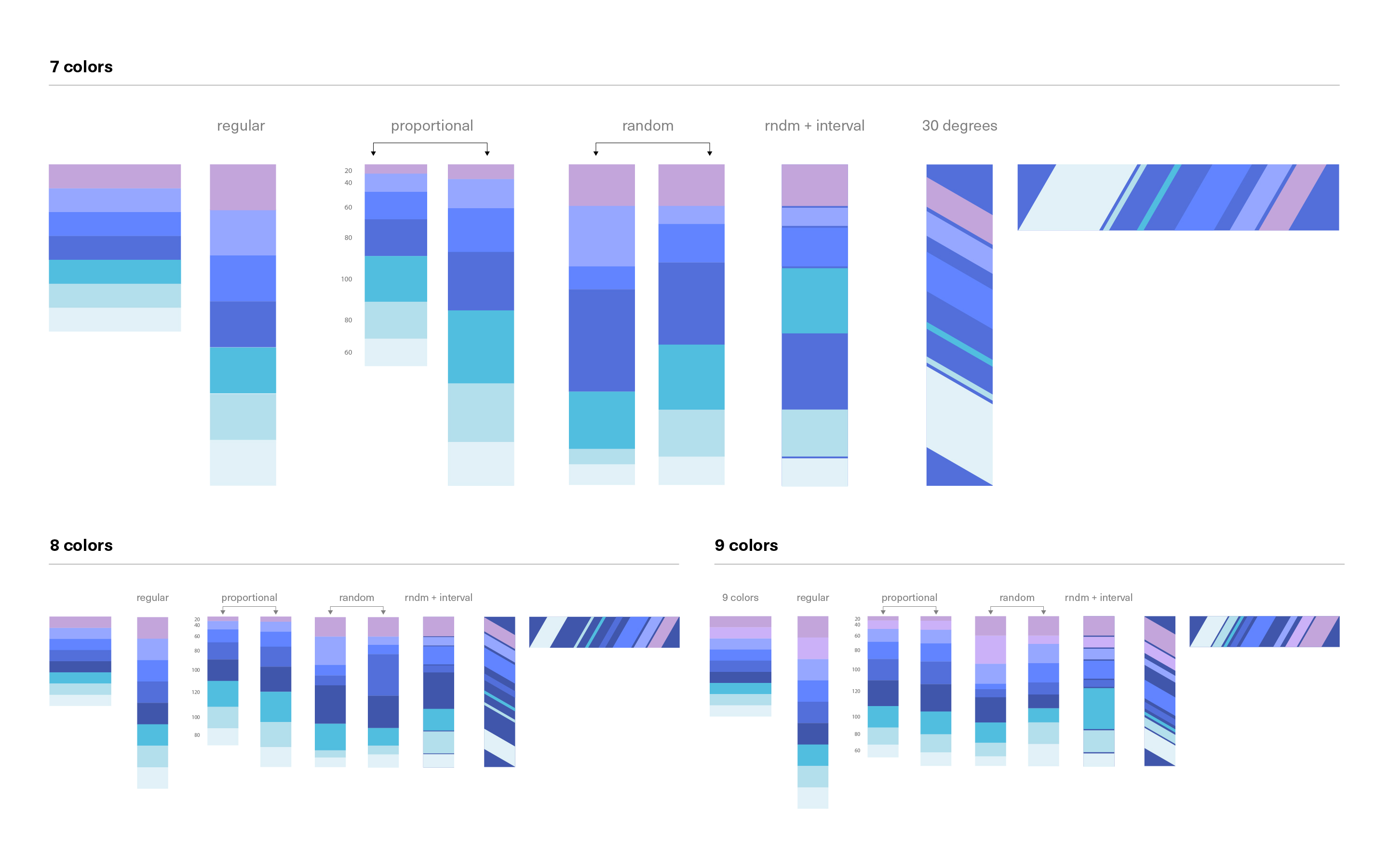
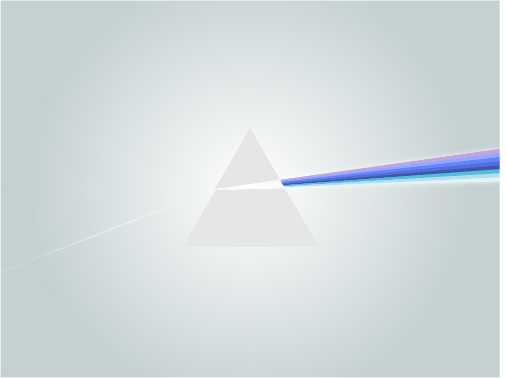
Leadership of GE Healthcare defined a new key narrative for the next generation of products. This vision is expressed through the metaphor of GEH as a catalyst of knowledge, incarnated as a prism and a “rainbow”. The outcome is a ray of light that propagates the GE colors, including pink in relation to the division oriented towards female healthcare. The request was to incorporate this “rainbow” into physical products and also the existing software. This new rainbow had to be adapted into the existing EDS color palette without disrupting existing components.

Visited the plant to learn about the hardware and usage conditions

Research to determine positioning, rhythm and density. The French Ribbon offers a vast collection of ribbons addressing these variables.

Paul Smith’s stripes served also as an inspiration when putting together a moldboard.

Color explorations with different possible configurations.

The stripe applied to the sign in screens.

The rainbow applied to the physical product

The rainbow applied as a shimmer of light.

The rainbow is subtly incorporated into the masthead navigation.