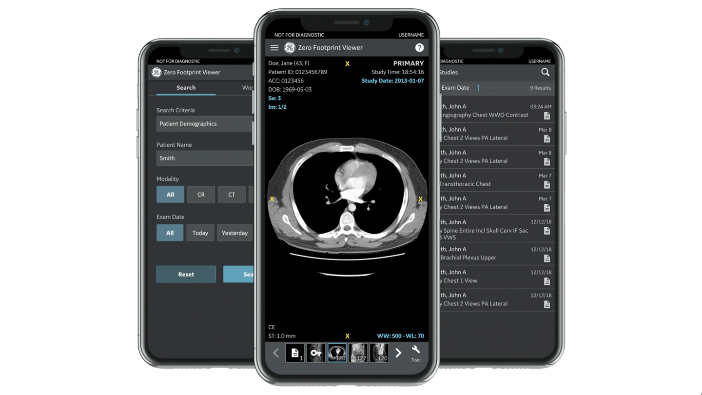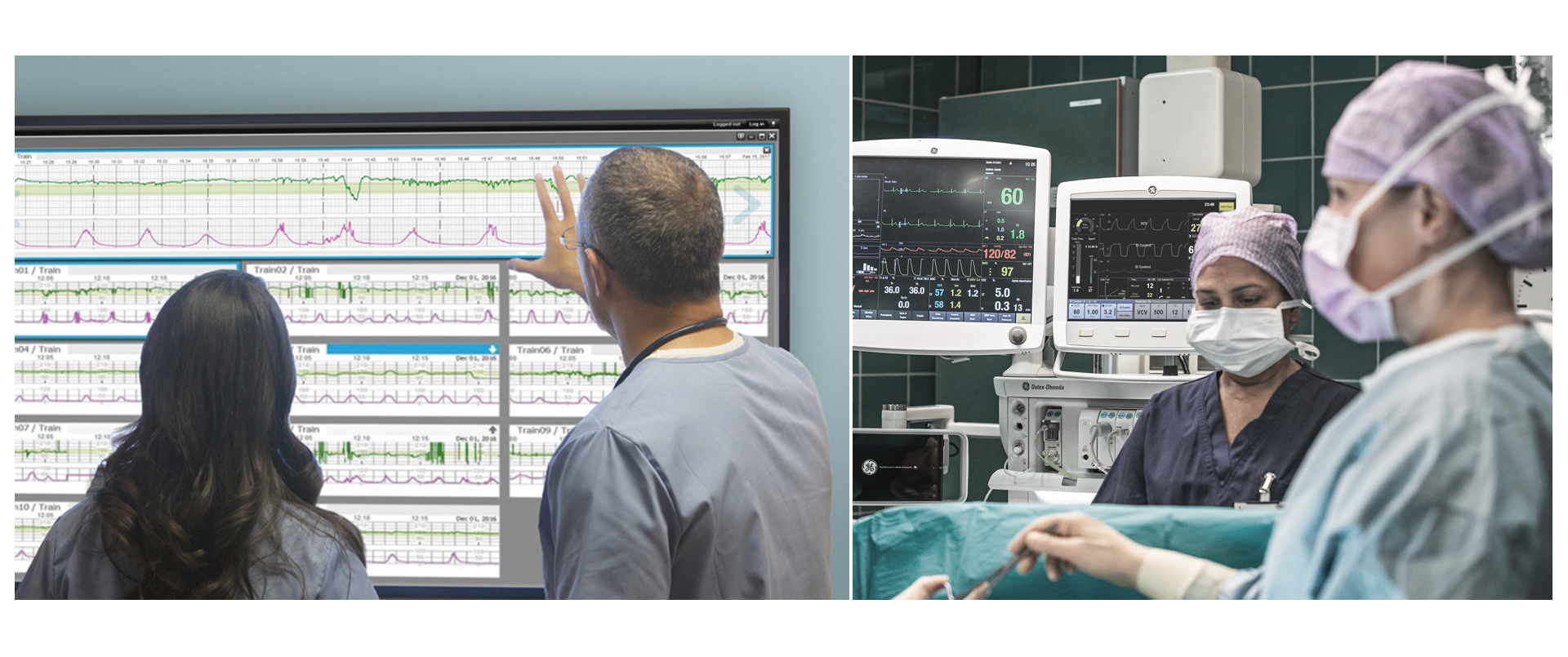
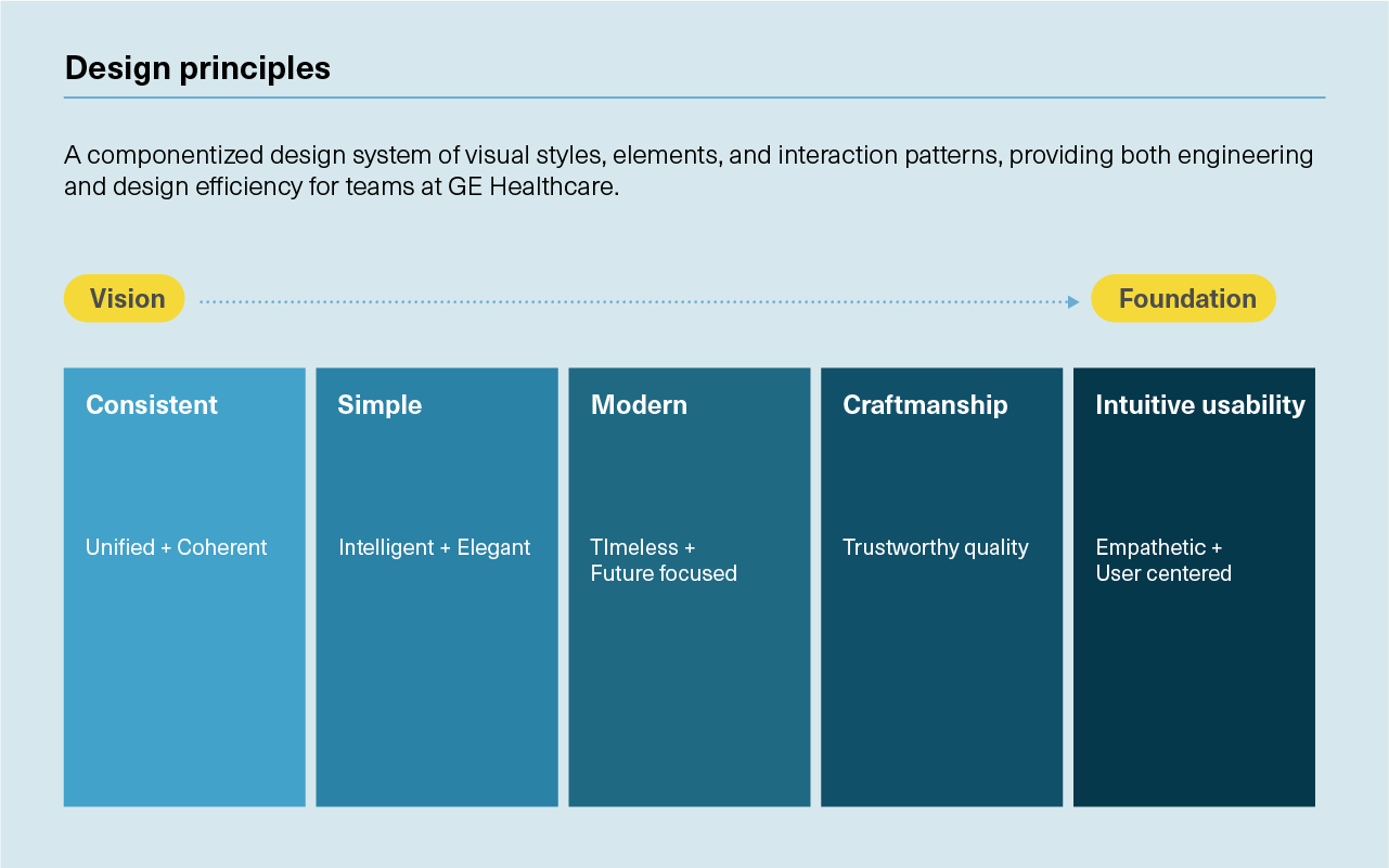
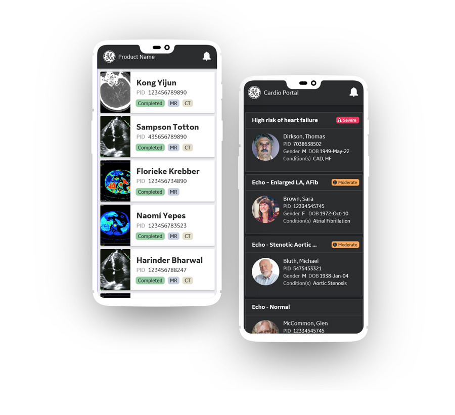
The Edison Design System is designed to serve healthcare professionals in the areas of radiology, cardiology and beyond.
UX | UI
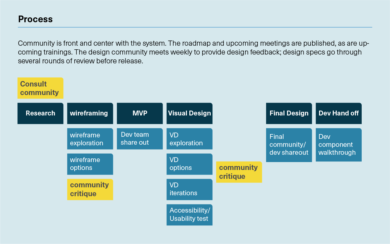
I provided new direction of core visual guidelines for the Edison Design System and expanded a multiplicity of components with use cases, guidelines and overall documentation.
The Edison Design System is designed to serve healthcare professionals in the areas of radiology, cardiology and beyond.
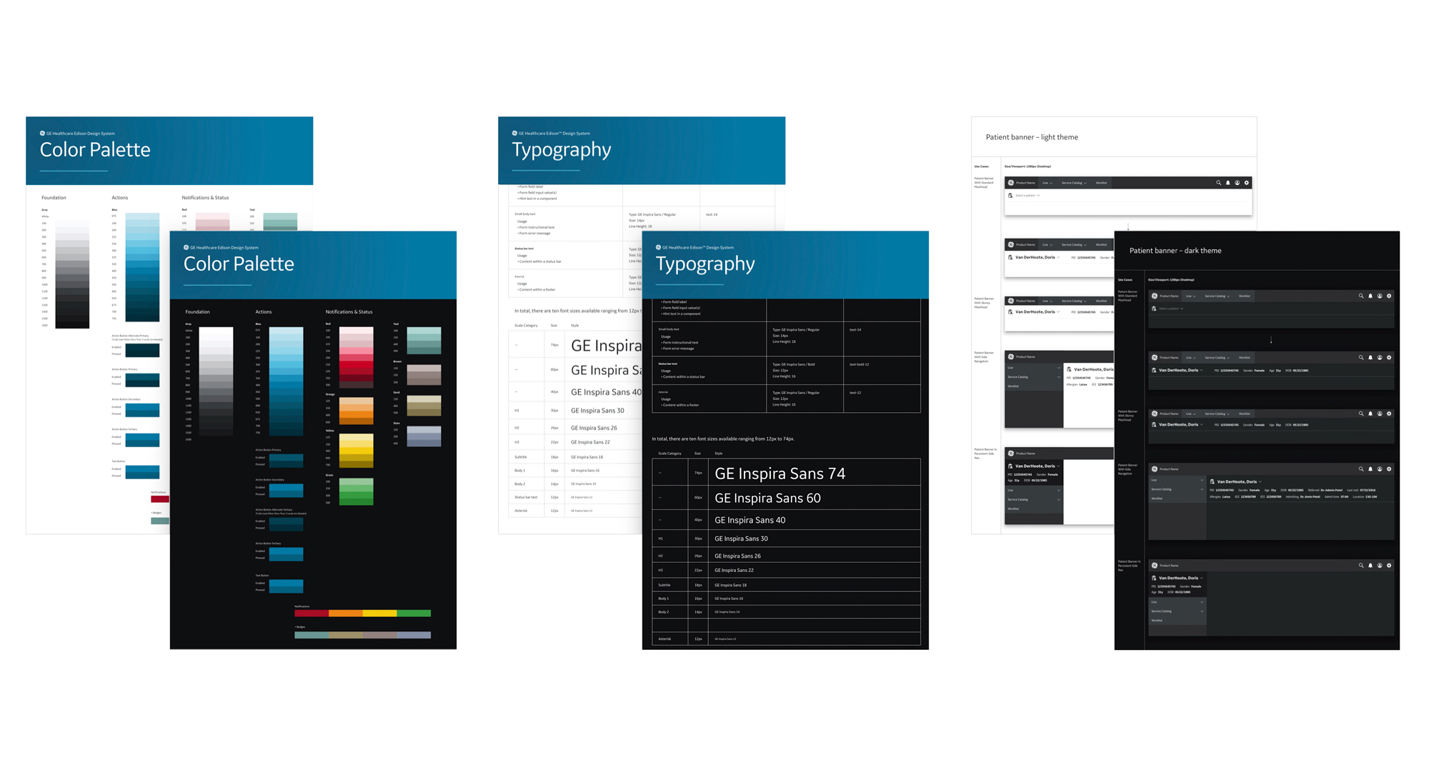
The system has dark and light themes. Dark was designed for maximum usability based on users’ typical room lighting
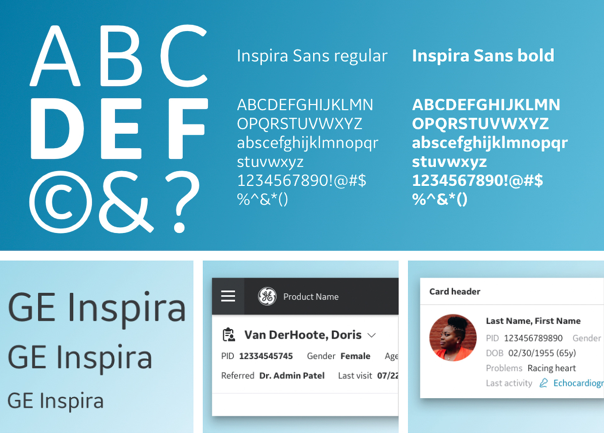
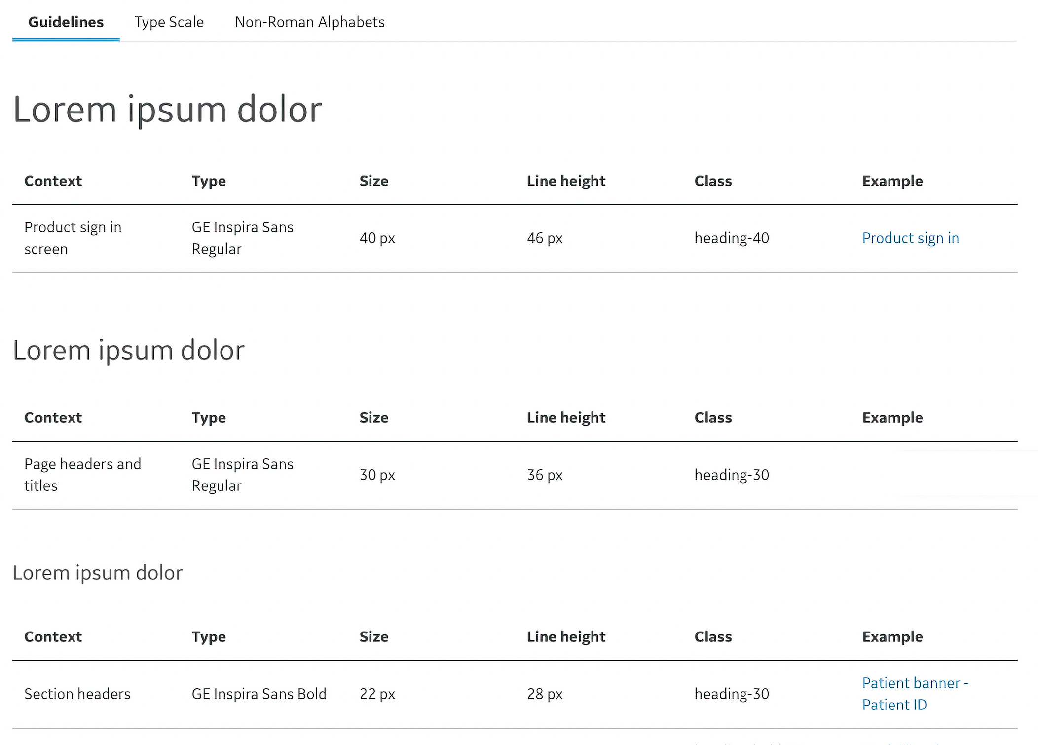
I contributed to define usage and guidelines for the typography system. I conducted a lengthy design exploration to define the typeface used for non roman languages. Noto is the Google font that was selected for these purposes.
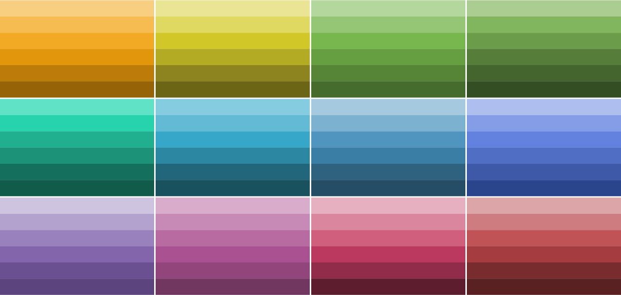
Based on user research and insights, I defined the current categorical color palette for data visualization and also the expansion into color families.
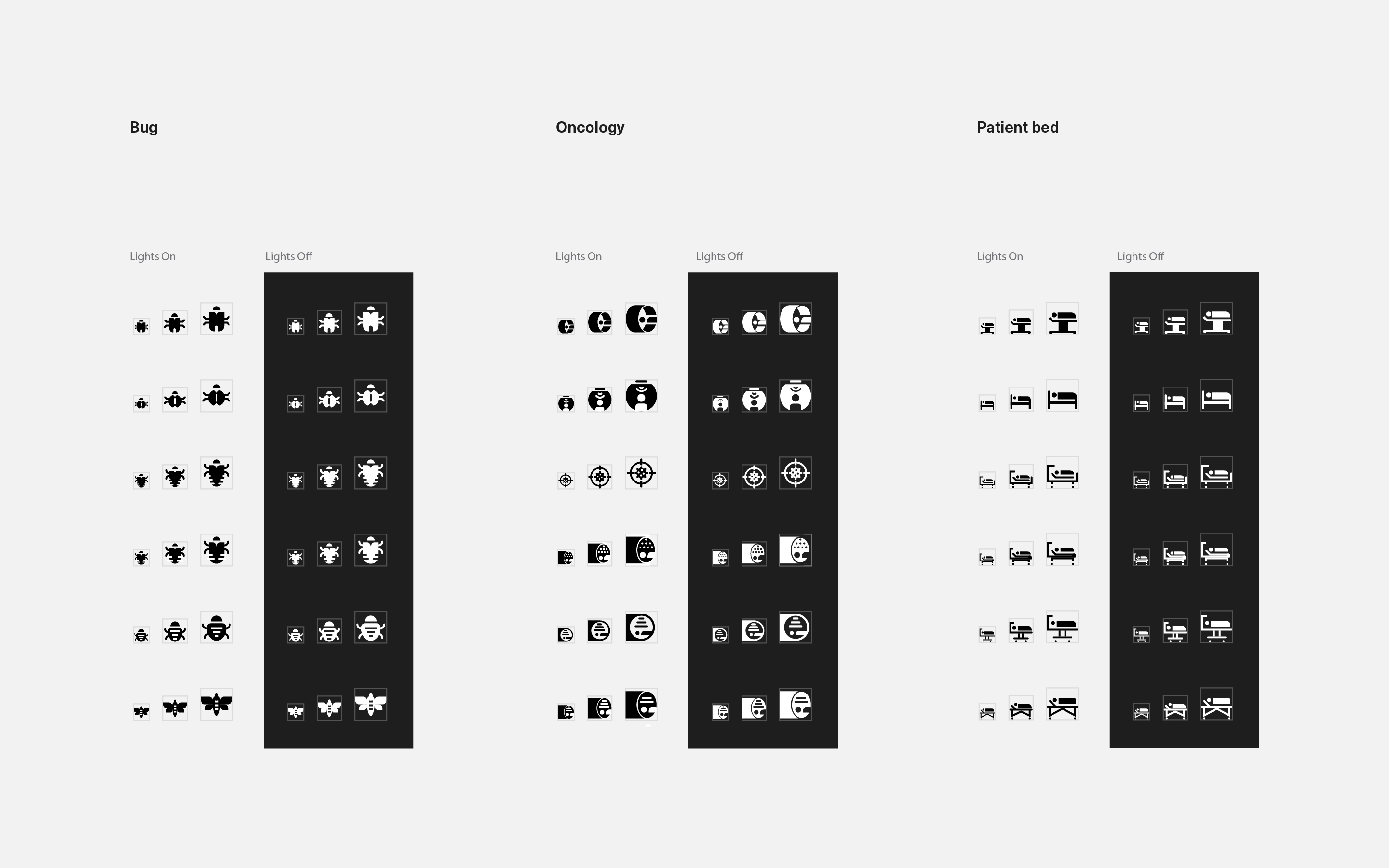
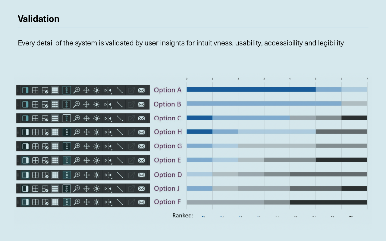
Every icon goes through a thorough exploration and revision to validate metaphor, readability and craftsmanship. Every icon is designed following strict drawing guidelines for three different sizes: 16 x 16, 24 x 24 and 32 x 32 px.
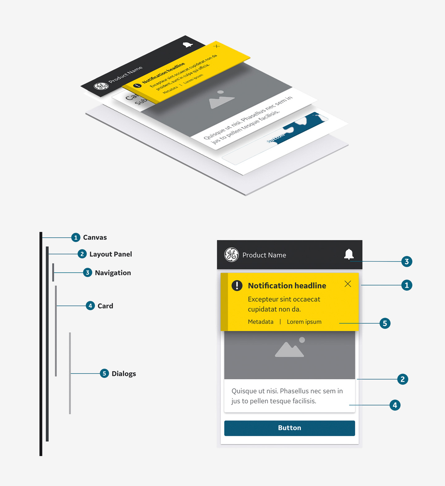
Cards are designed to be containers for displaying compositions of content and other elements that are grouped into a prescribed and often repeated layout to communicate information and or perform specific functions within the application. Cards are typically positioned within a panel in the UI, with the ability to be combined and stacked as needed..
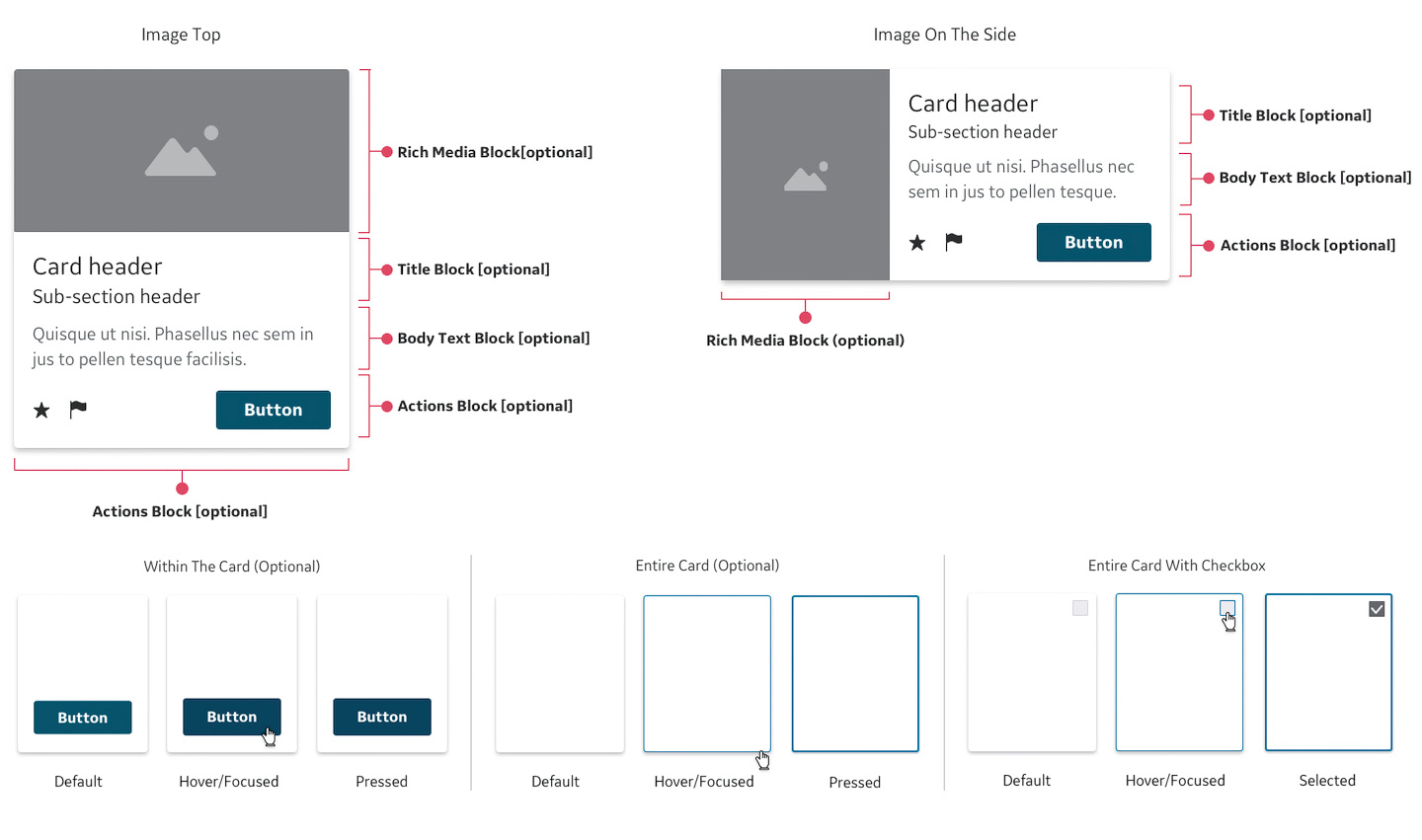
The card pattern is comprised of 4 primary areas or blocks, all of which are optional and configurable. The card container may exhibit different interaction state behaviors driven by the presence of an action button or form control in the defined pattern.