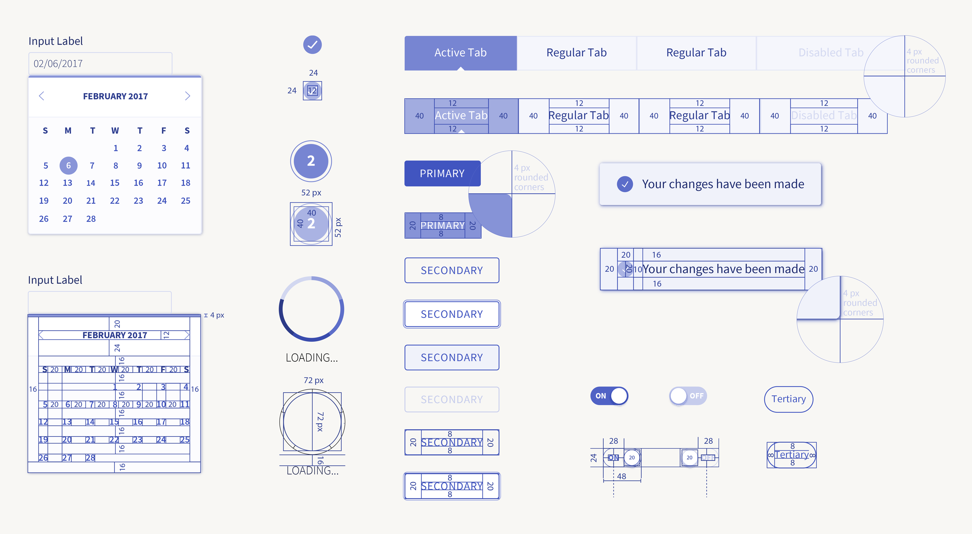
A library of more than 100 components is still under development and implementation. This is a small selection of key design elements of the system.
ux | ui
cui.conversantmedia.com
Companies from Anthropologie to Urban Outfitters depend on Conversant. I managed and mentored a team of UX designers so we could streamline an enterprise ecosystem of tools and apps. Together, we defined creative processes, created 100+ components, and built an in-house design practice.
A library of more than 100 components is still under development and implementation. This is a small selection of key design elements of the system.
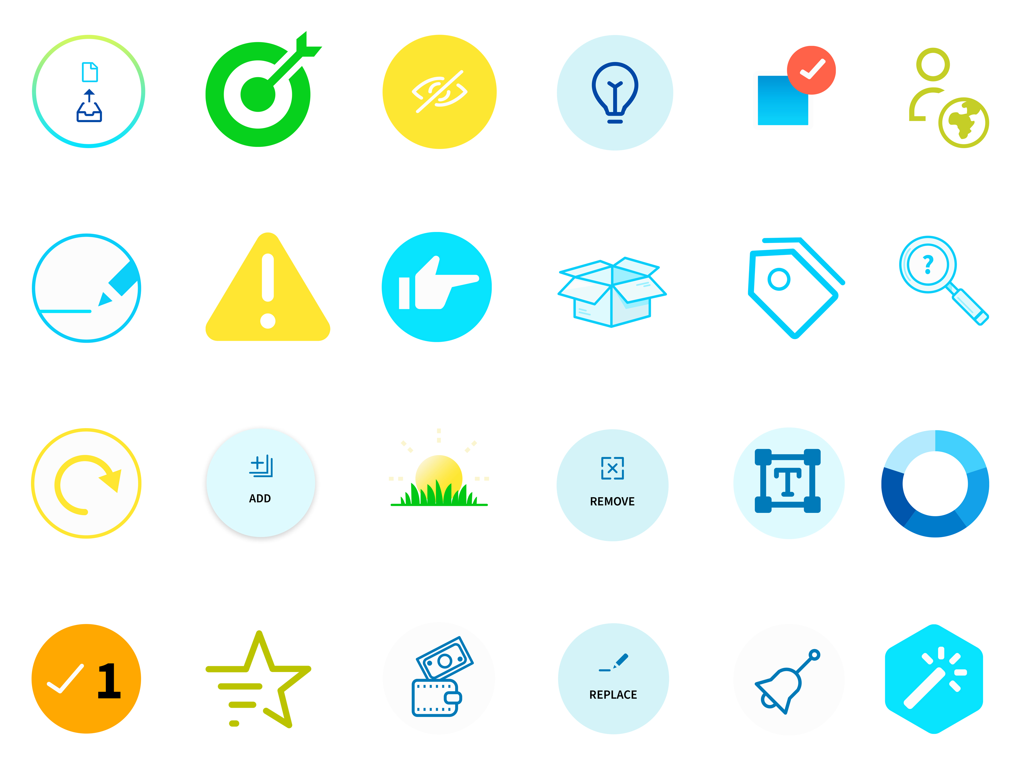
Reusable code for building elegant and user-friendly interfaces. CUI delivers a user experience built around principles of lightness, clarity, efficiency and consistency. Results: +150 components, 35 applications, 200% increase in app log ins, and 2000 automated tests.
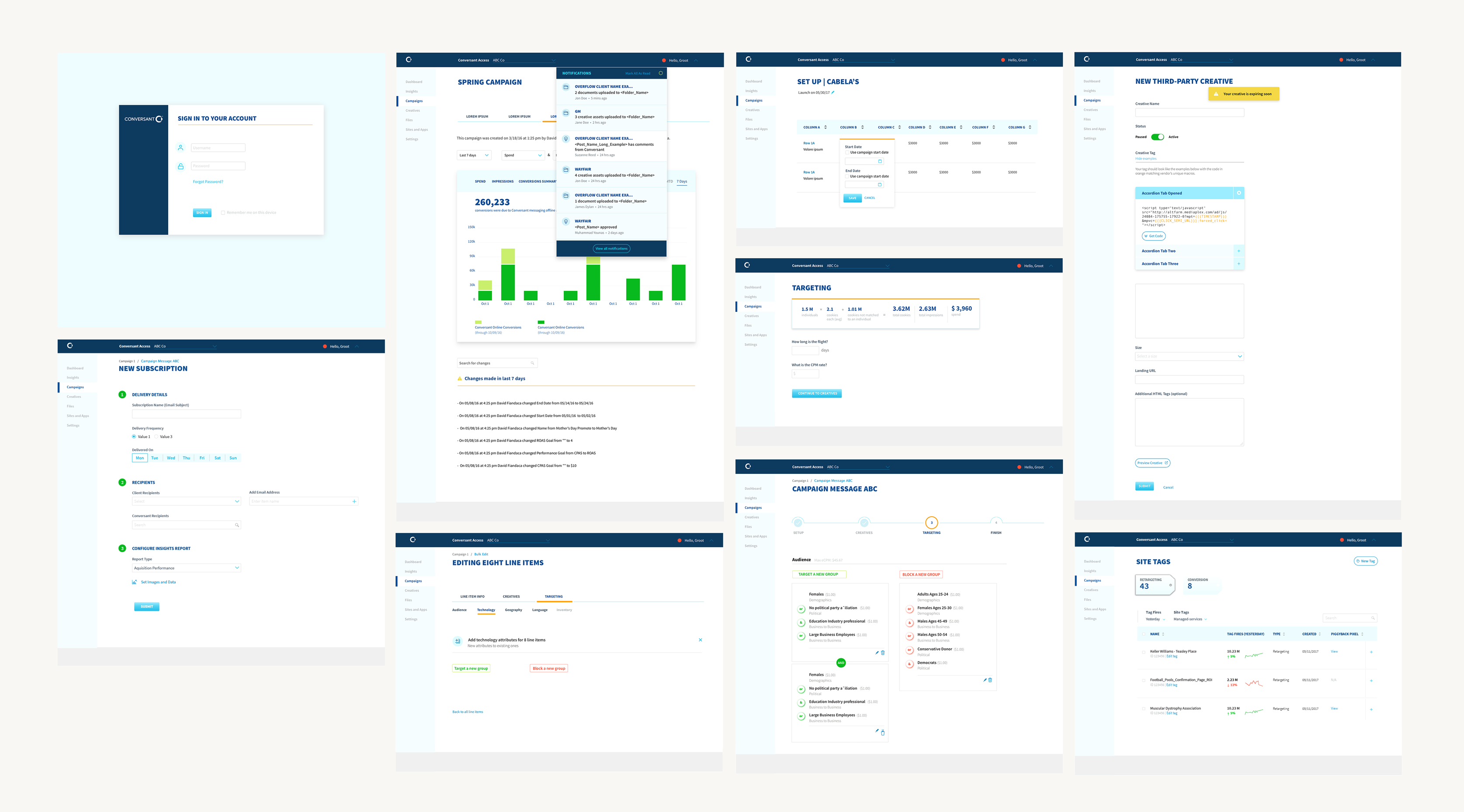
CUI is implemented across the entire Conversant’s ecosystem of applications serving the advertising-marketing space. Through a deliberate and diligent UX process it brings a seamless and consistent flow to services and users’ needs.
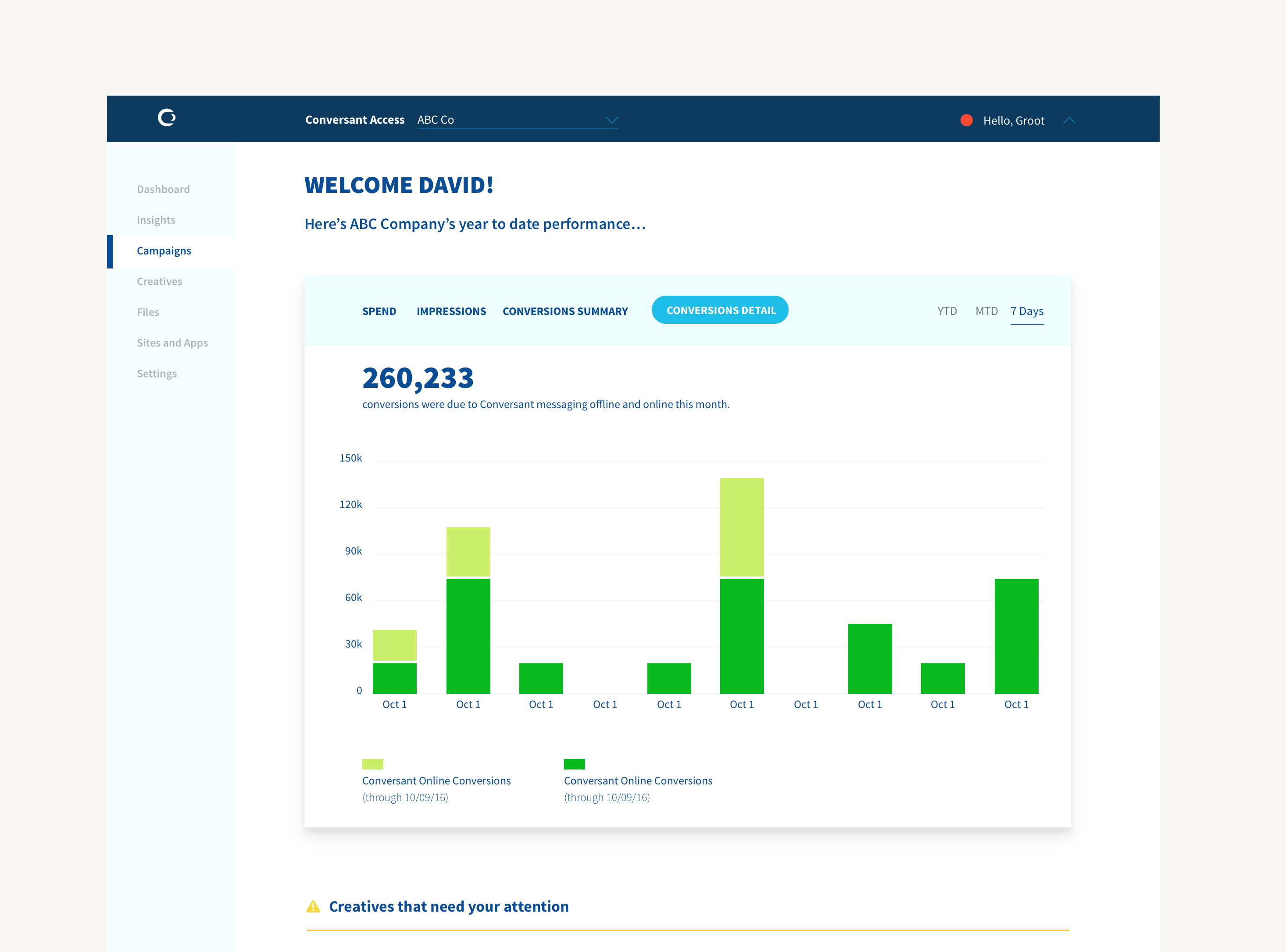
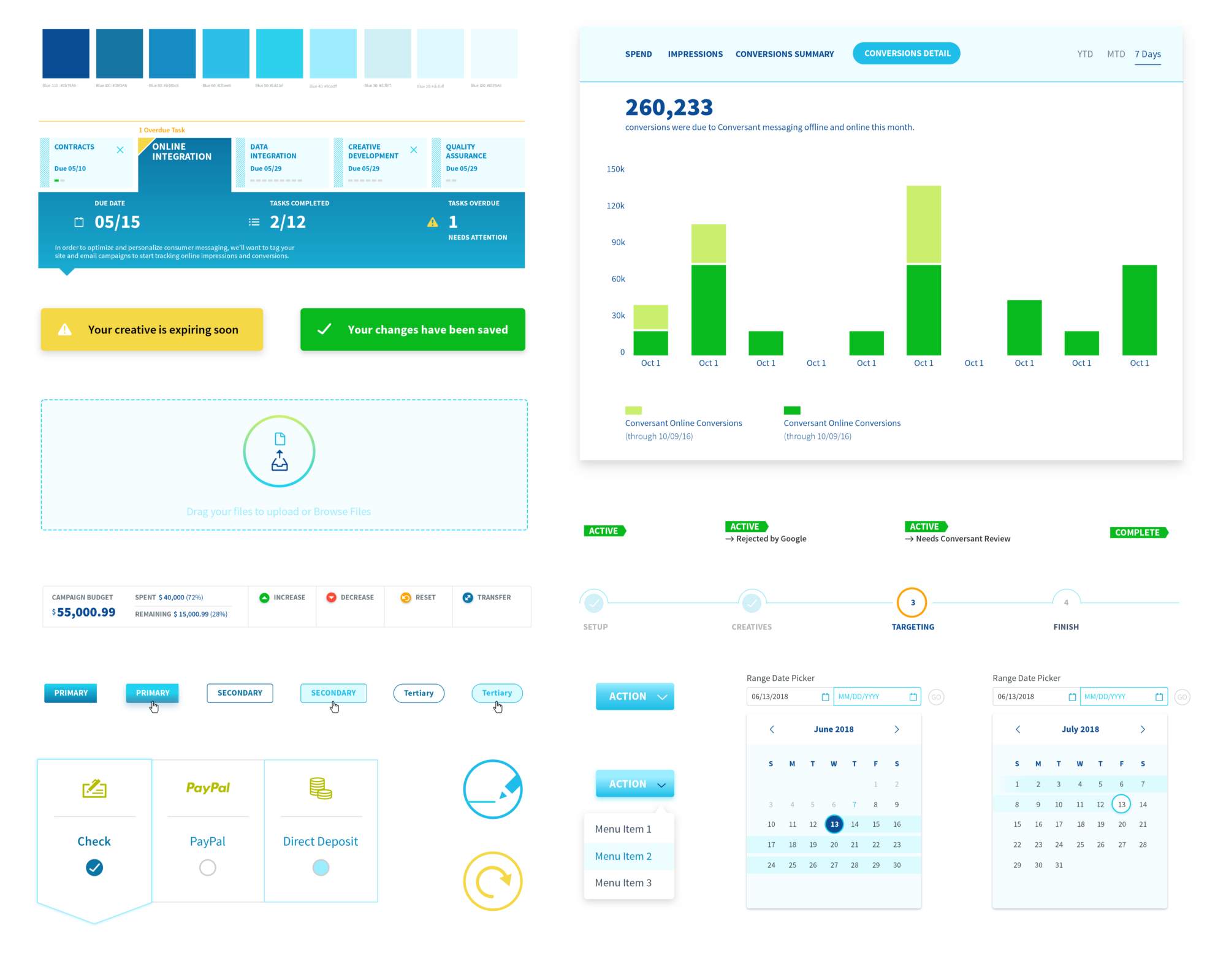
Campaign overview design for the CUI platform
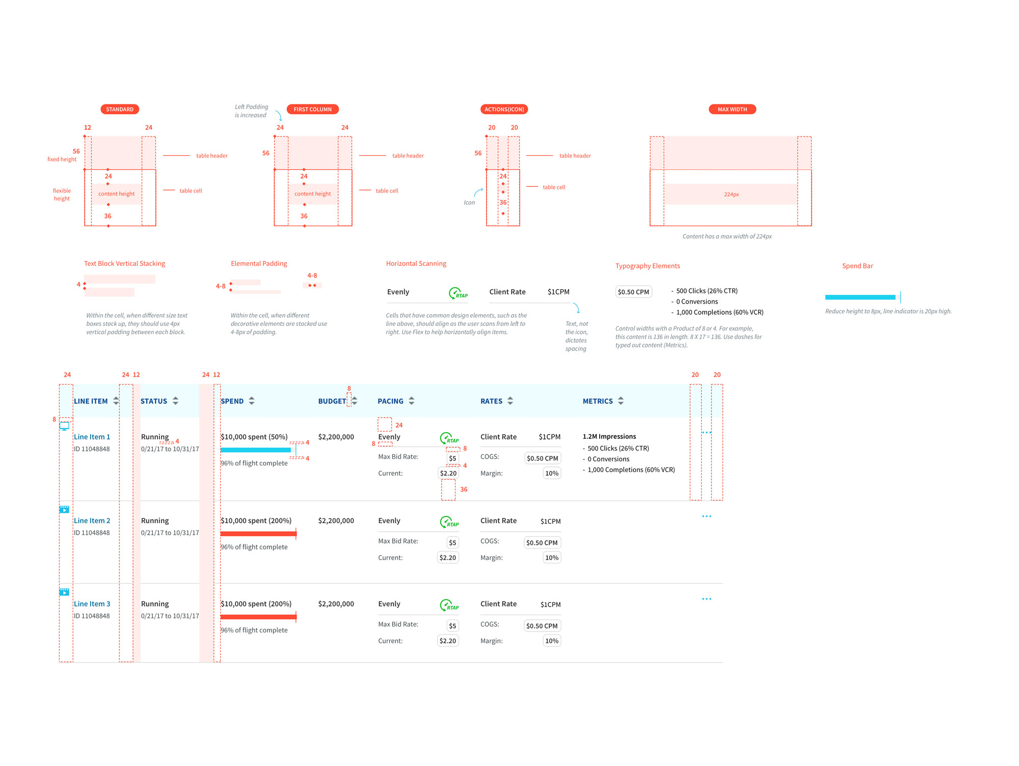
Table padding rules. Extensive documentation was created to define rules and consistent patterns for designers and developers.

Primary color palette for the system. An overall sense of lightness and vibrancy as core attributes to convey a frictionless, seamless and joyful UX were considered as foundational for both perceptual and functional patterns. Of course, secondary colors were added to empathize with usage patterns like success, warning and errors.
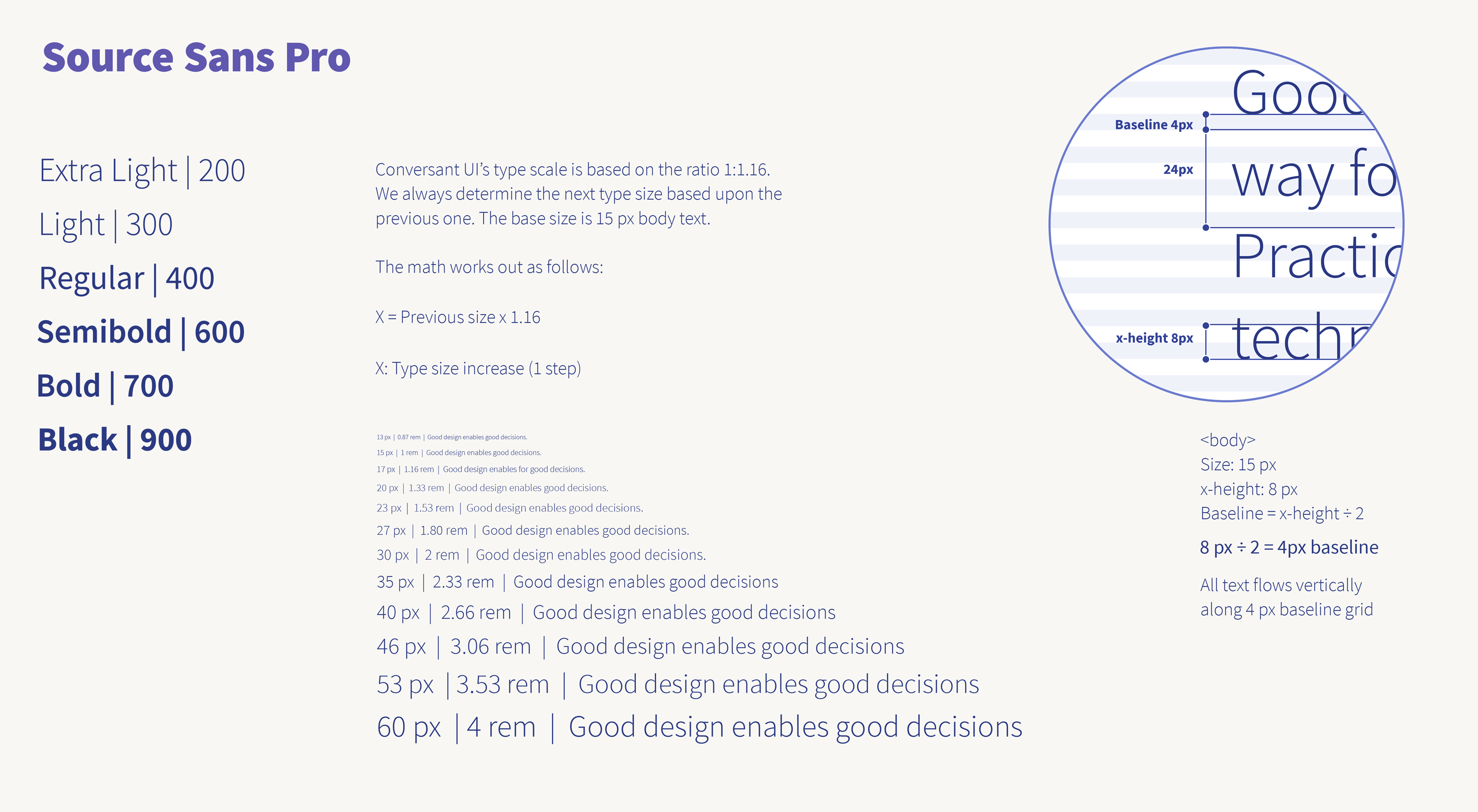
Conversant UI’s type scale is based on the ratio 1:1.16. We always determine the next type size based upon the previous one. The base size is 15 px body text. The math works out as follows:
X = Previous size x 1.16
X: Type size increase (1 step)
Together with the interaction and visual design team we explored motion patterns to provide cues about functionality and delight throughout the experience
Consistent use of a grid system provides the foundation for harmoniously and consistently positioning elements onscreen. Designing to the grid helps create an experience that facilitates understanding and brings order to the page.
It all starts with text
Size: 15 px
x-height: 8 px
Baseline = x-height ÷ 2
8 px ÷ 2 = 4px baseline
All text flows vertically
along 4 px baseline grid
Use multiples of 4px when defining measurements,
spacing, and
positioning elements.